One of the most important parts of CSS is setting the size and positioning of elements. I’ll show you all that in this article…
Getting started
Make a new project folder with index.html and style.css files in it. Add the following code to your index.html:
<!DOCTYPE html>
<html>
    <head>
        <title>CSS sizing and positioning DEMO</title>
        <link rel="stylesheet" href="style.css">
    </head>
    <body>
        <p>Lorem ipsum dolor sit amet, consectetur adipiscing elit. Praesent finibus fermentum mi vitae sollicitudin. Proin tempus enim nisl, eu rutrum ipsum venenatis sit amet. In non justo nec eros blandit mattis. Proin tempus ex lorem, id vulputate felis rhoncus facilisis. Aliquam quis pharetra metus.</p>
    </body>
</html>
To demonstrate the properties I’ll explain today, lets give the <p> a background-color. Put the following in your CSS:
p {
    background-color: cyan;
}
Open up your index.html file in a web browser - it should look like this:
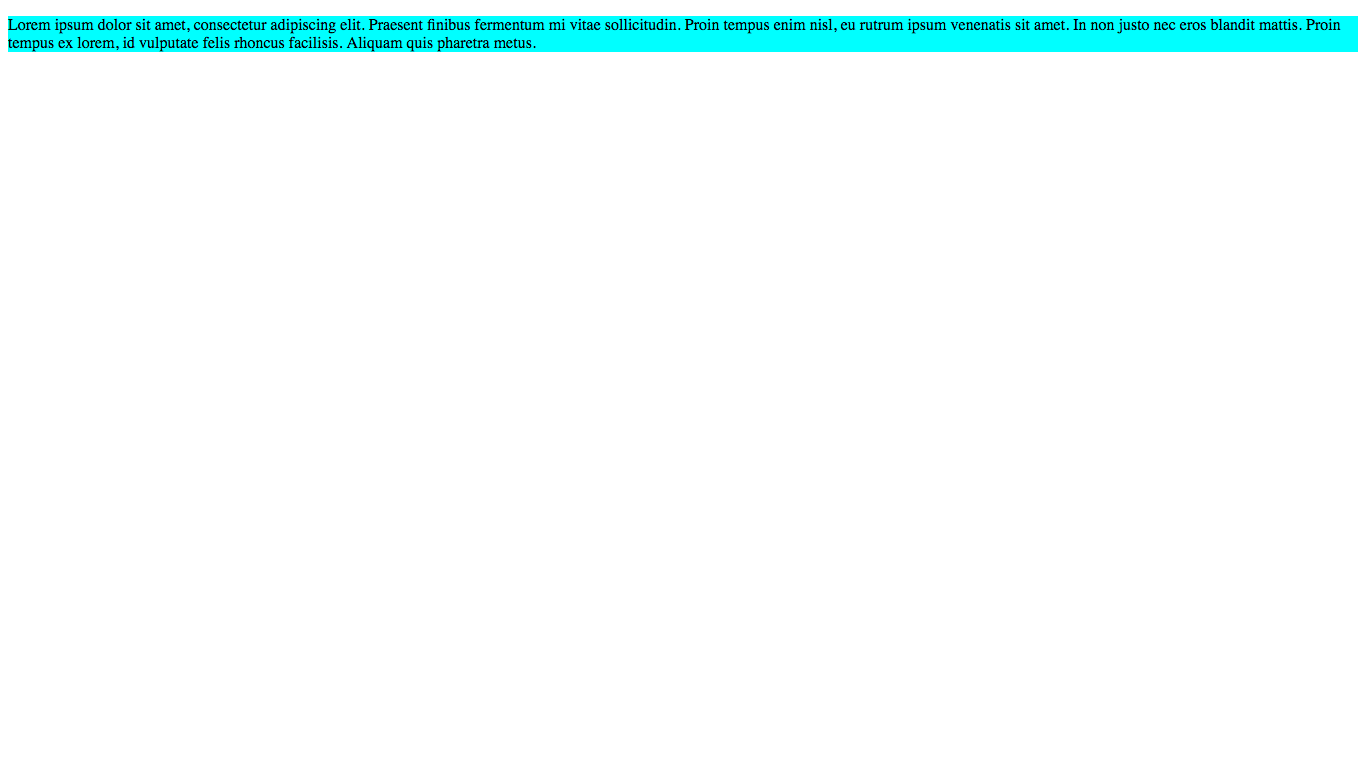
Cool! Now we’re ready to go!
NOTE:
The screenshots that I have taken in this tutorial are taken on my computer. Your results might look different compared to the overall screen size depending on the amount of pixels on your monitor.
Basic sizing properties
First, let’s lean how to set the dimensions of an element. It is fairly simple: just use the width and height properties. The values for the width and height properties must be in units. For this tutorial we will use the most simple units, px (pixels). For example:
p {
    background-color: cyan;
    width: 300px;
}
I will talk about many more types of units in this article. Try adding the width property to your stylesheet like above. Reload your browser window and see what happens:

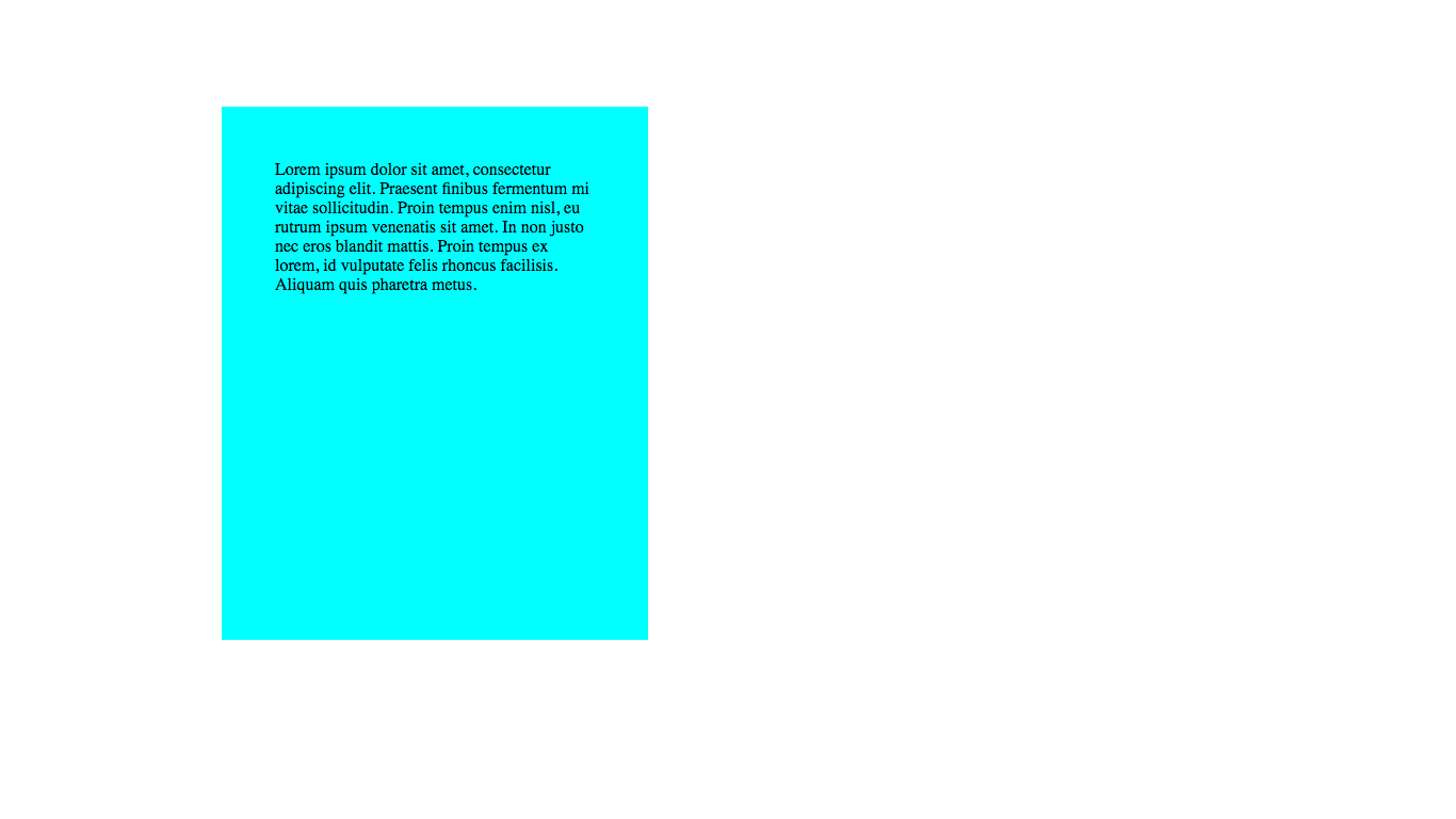
The height property works in a very similar way. Try setting your height property to 400px and see what happens:
p {
    background-color: cyan;
    width: 300px;
    height: 400px;
}
Result:
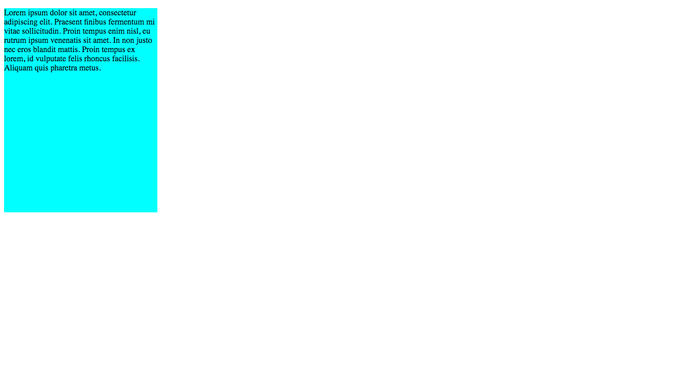
As you can see, the height of our paragraph is now much larger. Moving on…
Margin
What if we wanted to move our paragraph over to the right a bit? Or down a bit? This is where the margin property comes into play.
There are multiple margin-related properties:
margin: sets the same margin on all sides of an elementmargin-left: sets the margin to the left of an elementmargin-right: sets the margin to the right of an elementmargin-top: sets the margin above an elementmargin-bottom: sets the margin below an element
Think of margin as the space around the element, that no-one can enter. Kind of like an invisible force-field. If there is an element in its force-field, it just gets shifted down - but still retains the same amount of free space around it.
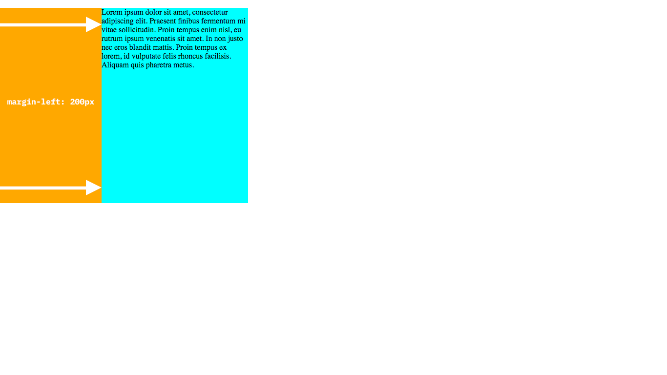
Let’s try it out by adding a margin-left of 200px to our paragraph:
p {
    background-color: cyan;
    width: 300px;
    height: 400px;
    margin-left: 200px;
}
Reload your page and see what happens:

Yay! Now our paragraph has been moved over 200px to the right! This is because there is an invisible force-field of free space 200px wide to the left of the element, pushing it to the right:
Try adding a margin-top to our paragraph as well, to push it downwards by 100px. See if you can guess what the CSS will look like:
p {
    background-color: cyan;
    width: 300px;
    height: 400px;
    margin-left: 200px;
    margin-top: 100px;
}
Preview your code. Now, your web-page should look like this:
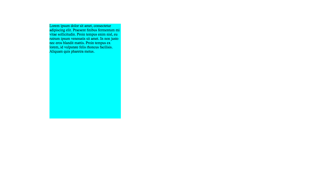
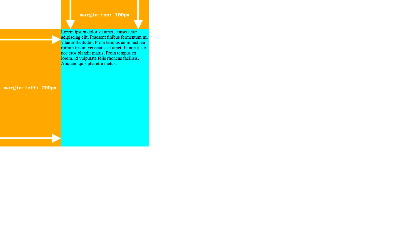
There we go! Now you know all about margins!
Padding
So far, our text is bunched up right against the edges of the cyan rectangle (see the images above). This looks ugly! But wait… padding to the rescue!
Just like margin, there are multiple padding-related properties:
padding: sets the same padding on all sides of an elementpadding-left: sets the padding on the left of an elementpadding-right: sets the padding on the right of an elementpadding-top: sets the padding on the top an elementpadding-bottom: sets the padding on the bottom an element
But what is padding? padding is like margin except inside the element instead of outside the element. It is free space inside the element, and is often used to stop stuff from being right at the edge of an element (like our text!)
Let’s fix our text by giving it a padding property of 50px. Note that we are using padding, not padding-left etc. because we don’t want the text to hit any of the edges. See if you can work out what our CSS should look like:
p {
    background-color: cyan;
    width: 300px;
    height: 400px;
    margin-left: 200px;
    margin-top: 100px;
    padding: 50px;
}
Now, update your CSS file and reload the page…
Here is where the padding (and margins) are:
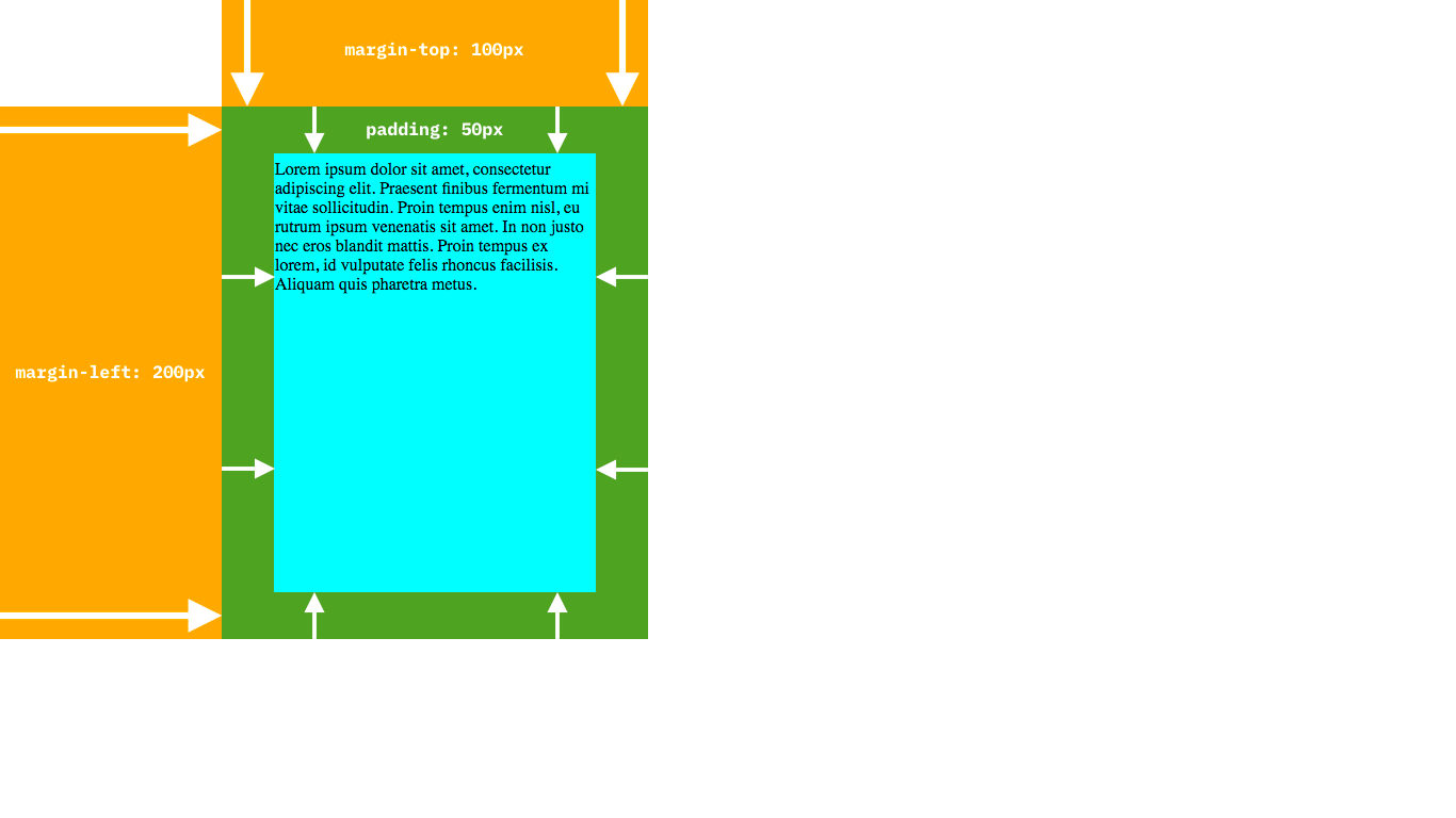
You will notice that the empty space where the padding is still has a blue background - this is because the empty space is inside the element, so that part also has a blue background.
One thing to be careful of is that the padding and margin are NOT part of the width and height of an element - so often an element will appear wider or higher than its actual width or height.
Conclusion
Well done! We covered some pretty big concepts today, so congrats if you were able to get your head around them. If not, have a look through again and if you need any help then you can ask in the comments below and I’ll be happy to help (by the way, if you have any feedback you can tell me there too).
If you liked this article, I’d really appreciate if you shared it with your friends and also signed up to the newsletter.
Have fun and I’ll see you next time, where I’ll be talking about more advanced CSS positioning, such as fixed positions and display types. See you then!