Background images can do more than you think - learn about cool ways to manipulate background images using CSS…
Getting started
I think that it is best to learn by doing, so I highly recommend following along in all my tutorials. To follow along start by making a new project folder with index.html and style.css files in it. Add the following code to your index.html:
<!DOCTYPE html>
<html>
    <head>
        <title>CSS advanced background images DEMO</title>
        <link rel="stylesheet" href="style.css">
    </head>
    <body>
        <h1>Background images</h1>
    </body>
</html>
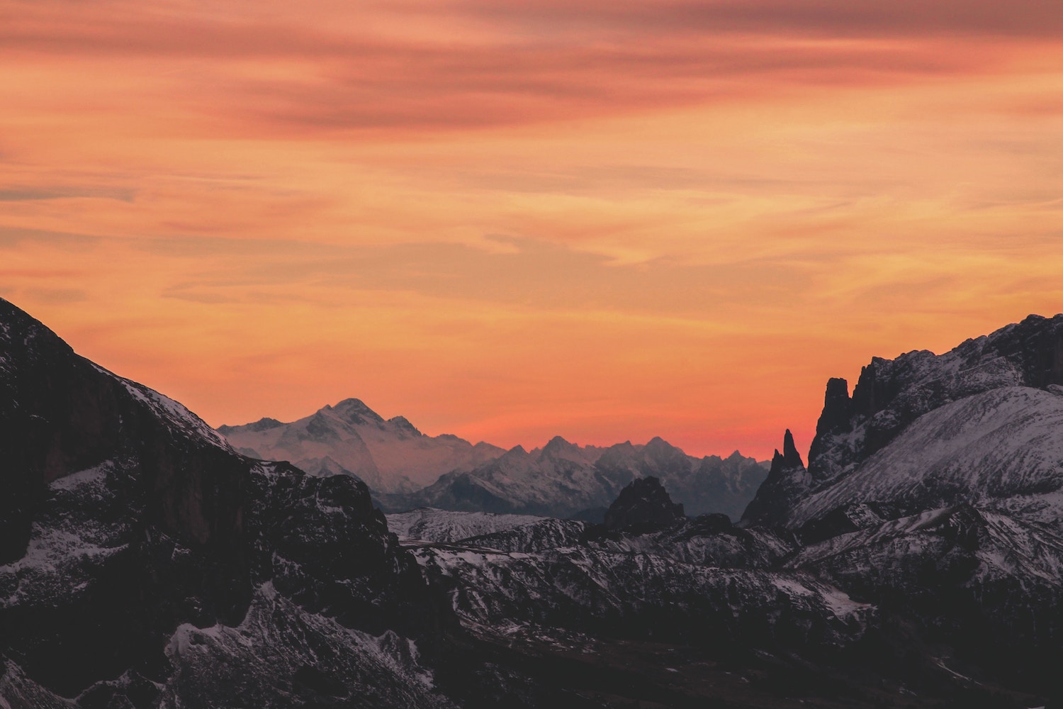
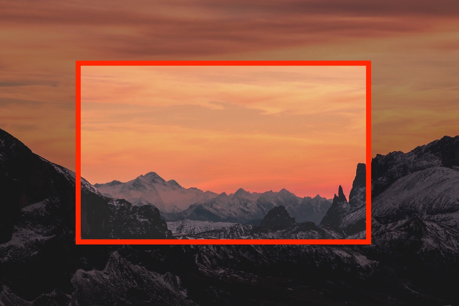
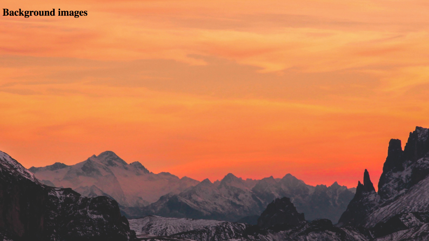
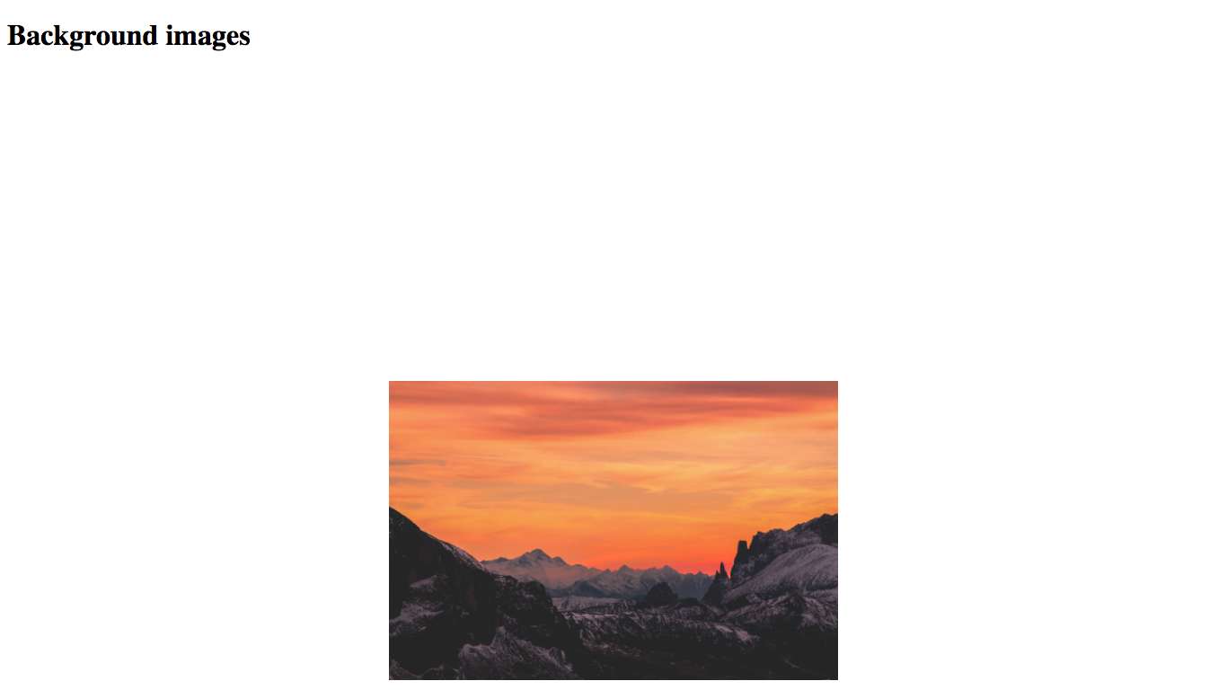
The image that I will be using for the demos in this article is the following:
And add a background-image to the body element in your style.css file:
body {
    height: 150vh;
    background-image: url('https://codetheweb.blog/assets/img/posts/css-advanced-background-images/mountains.jpg');
}
If you don’t know how to use the background-image property, check here first - I’ll be here when you get back!
The reason for the body height is so that we can scroll on our page - you will see why this is relevant later in the tutorial. 150vh basically means 150% of the viewport height.
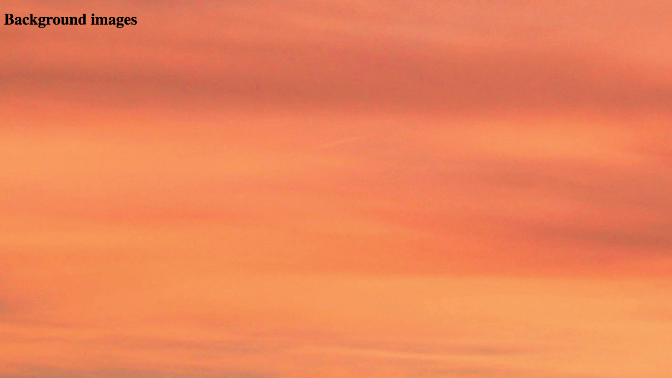
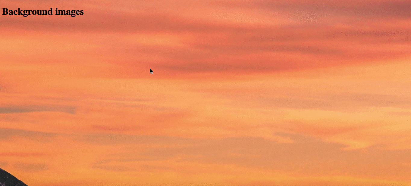
When you open your HTML file in a browser, it should look like this:
If yours is looking right, let’s continue!
Background-image related properties
As well as the background-image property, there are many properties that modify how the background-image is displayed:
background-sizebackground-positionbackground-repeatbackground-size
In this article, I’ll be going through each one individually… Let’s get started!
background-size
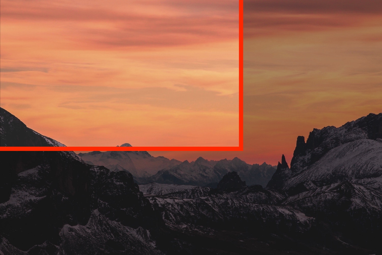
Remember our original image?
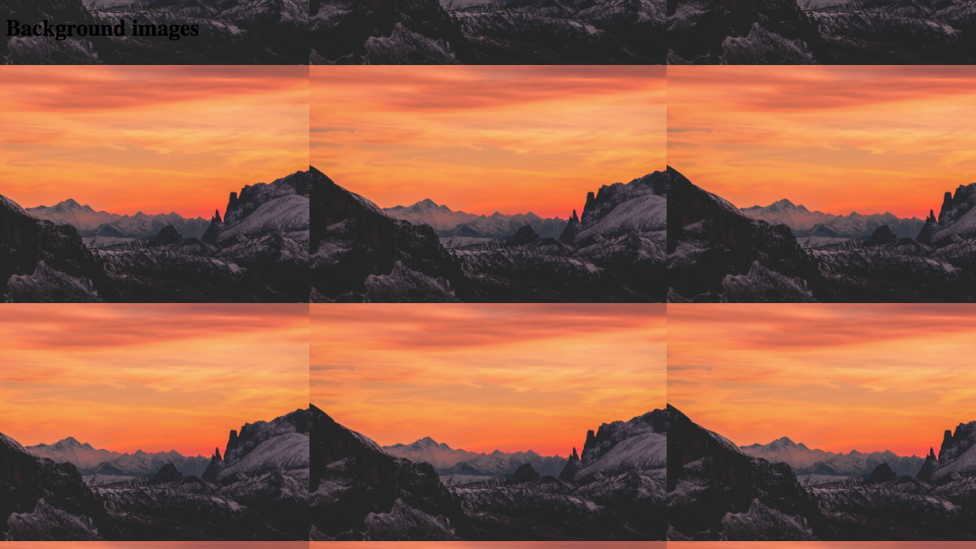
However on our page, it is super-zoomed in on the sky!
This is because, by default, the background-image is set to the actual dimensions of the image (4272px by 2848px)
Let’s fix this up!
The background-size property can be set to either cover, contain or any unit value (eg. 1500px).
background-size: cover sets the image size so that it covers the entire element (in this case the body).
background-size: contain makes sure that all of the background-image is shown within the element.
In this case, we’ll want to use cover - this way we can see most of the image, but it will cover the whole screen! Let’s try it out:
body {
    height: 150vh;
    background-image: url('https://codetheweb.blog/assets/img/posts/css-advanced-background-images/mountains.jpg');
    background-size: cover; /* Add this line */
}
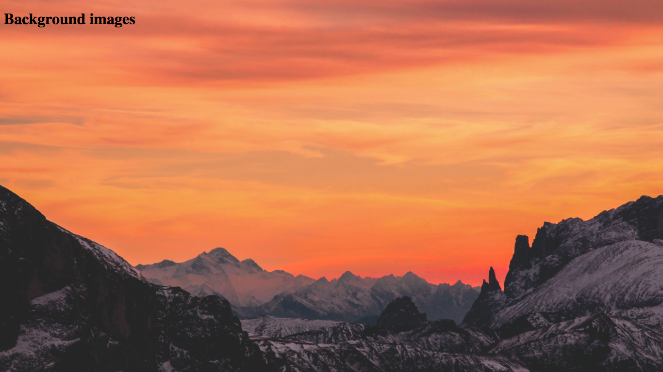
Result:
If you scroll down, you can see more of the image - this is because it is covering the body element (which is 150% of the viewport height), not the actual screen.
You can also set the background-size to an actual value - change your CSS to this:
body {
    height: 150vh;
    background-image: url('https://codetheweb.blog/assets/img/posts/css-advanced-background-images/mountains.jpg');
    background-size: 2000px; /* Change this line from cover */
}
Result:
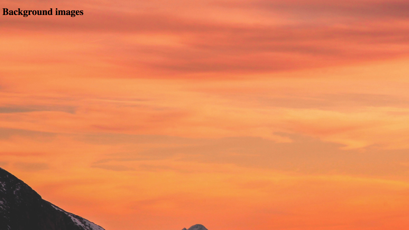
Again if you scroll down, you will see a bit more of the image.
background-attachment: fixed
background-attachment: fixed; is used to to make the image stay in the same place as you scroll down. It is kind of like position: fixed but for background images. Let’s try it out and see what it does:
body {
    height: 150vh;
    background-image: url('https://codetheweb.blog/assets/img/posts/css-advanced-background-images/mountains.jpg');
    background-size: 2000px;
    background-attachment: fixed; /* Add this line */
}
Now when you scroll down the page, the background-image will not move with it:
IMPORTANT:
Before continuing, remove thebackground-attachment: fixedline, so that we can focus on the other properties. Your CSS should look like this:body { height: 150vh; background-image: url('https://codetheweb.blog/assets/img/posts/css-advanced-background-images/mountains.jpg'); background-size: 2000px; }
background-position
As you can see, not the whole image is shown - but which part is shown?
What if we want to show the center of the image?
This is where we can use the background-position property:
body {
    height: 150vh;
    background-image: url('https://codetheweb.blog/assets/img/posts/css-advanced-background-images/mountains.jpg');
    background-size: 2000px;
    background-position-x: center; /* Add this line */
    background-position-y: center; /* Add this line */
}
Result:
The background-position-x and background-position-y are used to position the image horizontally (x) and vertically (y).
The accepted values for background-position-x are:
leftcenterright
And for background-position-y:
topcenterbottom
In addition, both accept numerical values eg 200px. They are calculated from the top-right corner. So for example, a background-position-x of 500px would be 500px from the left, and a background-position-y of 300px would be 300px from the top.
For the moment, let’s leave both as center… (although you can play around if you want 😉)
background-repeat
You know those tiled backgrounds? Often this looks ugly but can work well with repeating textures. In this case, we’re just going to use our mountain image so that the tiling is more obvious. Let’s see what happens when we tile an image:
body {
    height: 150vh;
    background-image: url('https://codetheweb.blog/assets/img/posts/css-advanced-background-images/mountains.jpg');
    background-size: 500px; /* Change this line from 2000px, so that we can see it tiling */
    background-position-x: center;
    background-position-y: center;
}
Result:
Wait, what? But this is a rip-off! We didn’t even use background-repeat!
This is because a background has background-repeat turned on by default. The only reason that it didn’t happen before was that our image was so large that it didn’t need tiling.
The background-repeat property has two main values: repeat and no-repeat. It’s as simple as that!
By default background-repeat is set to repeat, so you will not usually need to use that. However, what if you want to turn off the tiling? Let’s try it out:
body {
    height: 150vh;
    background-image: url('https://codetheweb.blog/assets/img/posts/css-advanced-background-images/mountains.jpg');
    background-size: 500px;
    background-position-x: center;
    background-position-y: center;
    background-repeat: no-repeat; /* Add this line */
}
Result:
(the reason that the image is near the bottom of the screen is because the body height is 150%, remember?)
There we go! That’s how the background-repeat property works in CSS!
Multiple backgrounds
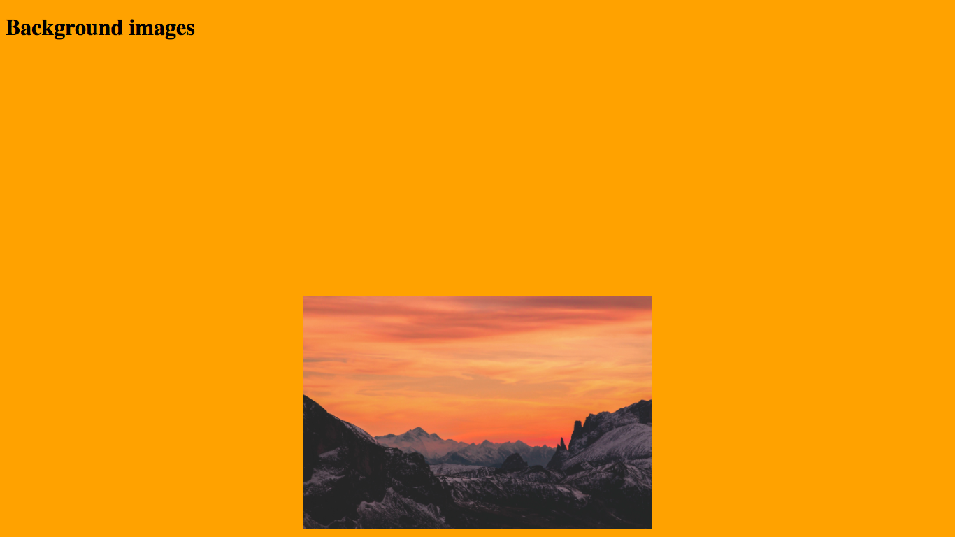
You will notice that now there is ugly white around our image. What if we wanted to make that, let’s say, orange for example? Believe it or not, you can actually specify multiple backgrounds in CSS!
The first background will be put on the screen, and other backgrounds after will be layered on top.
So, let’s try it out! Remember, the background-color: orange comes first because we want it below the image:
body {
    height: 150vh;
    background-color: orange;  /* Add this line */
    background-image: url('https://codetheweb.blog/assets/img/posts/css-advanced-background-images/mountains.jpg');
    background-size: 500px;
    background-position-x: center;
    background-position-y: center;
    background-repeat: no-repeat; /* Add this line */
}
Result:
Conclusion
Okay, there we go! You’ve just learned a bunch of cool stuff that you can do with background images, and these properties come in handy very often. If you have any feedback or need any help, hit me up in the comments.
Also if you liked this article, I’d love it if you shared it or signed up to the newsletter. It takes a lot of time and effort to make a blog (25,000 words and counting), and I’d really appreciate if you did one (or both!) of those things.
Have fun and I’ll see you next time, where I’ll be talking about the different types of units in CSS and what they do - there are more than you think!