There are many types of units in CSS, that serve for a range of purposes. Learn about them all in this article!
Getting Started
I think that it is best to learn by doing, so I highly recommend following along in all my tutorials. To follow along, start by making a new project folder with index.html and style.css files in it. Add the following code to your index.html:
<!DOCTYPE html>
<html>
    <head>
        <title>CSS units DEMO</title>
        <link rel="stylesheet" href="style.css">
    </head>
    <body>
        <div id="demo">CSS units are cool</div>
    </body>
</html>
And add the following to your style.css:
body {
    margin: 0; /* Remove default margins */
}

#demo {
    background-color: cyan; /* So that we can see the width/height */
}
Note: For the rest of this article, I’ll not be including the bit about the
bodyin the code. Just remember to keep it at the top of your CSS file. The reason for this is because by default the body has margins which can stuff positioning in some cases.
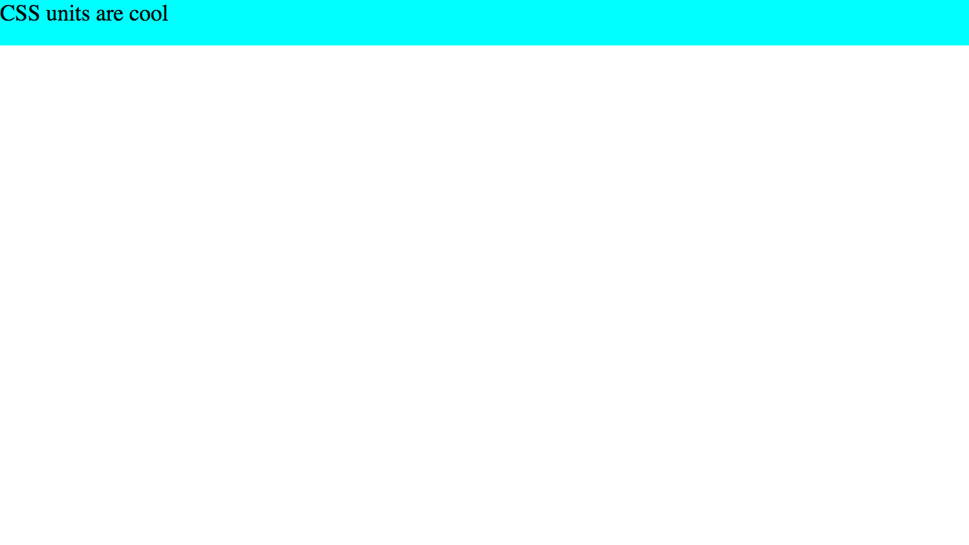
Open up your index.html in a web browser. If everything is going fine, it should look like this:

Let’s get going!
Fixed units
Fixed units are simple - they stay the same size, no matter the circumstances. For example, 2px will always be the same 2px. However, other units (such as vw) can change. The fixed units allowed in CSS are:
| Unit | Meaning |
|---|---|
| px | pixels |
| cm | centimeters |
| mm | millimeters |
| in | inches |
| pt | points ( = 1/72 of 1 inch) |
| pc | picas ( = 12pt) |
Just a note about
px: A pixel is one pixel on the viewer’s screen. This means that a pixel can change based on the viewer’s screen resolution (because the amount of pixels is not always proportional to the size of the screen, and pixels can be smaller or larger).However, pixels are still considered fixed units because they cannot change once the website is loaded.
You can try out all of the fixed units on your demo page if you want. I’m not going to do so here because it’s pretty self-explanatory, but basically something like this (with whatever unit you’re using):
#demo {
    background-color: cyan;
    height: 6cm;
}
Result:

The general convention with fixed units is to always use px, but there is no reason not to use any of the other units. Don’t worry about memorizing pt and pc, you will rarely if ever need those.
So, that’s it for fixed units. There really isn’t much to them (although it’s good to know they exist). Now on to the juicy part!
Relative units
Relative units can change, because they are relative to another length. This means than lengths such as 2vw will be different sizes depending on the length of their reference. Let’s get going!
em
em units are relative to the font size of the element. For example, let’s say we have a div and we want to set the height to 2em - that means we are setting it to two times its font size. In fact, let’s try that out!
#demo {
    background-color: cyan;
    height: 2em;
}
Result:

As you can see, the height of our <div> is now two times its font-size! This means that it is (approximately) double the height of the text.
em is also very useful when setting the font-size property! For example, if we want to double the size of our text we simply say font-size: 2em. Let’s try it out!
#demo {
    background-color: cyan;
    height: 2em;
    font-size: 2em; /* Add this line */
}
Result:
As you can see, the font-size has doubled. But so has our height - what? Well because the font-size has doubled, so has the height, because it is set to two times the font-size.
This is the nature of relative units! Our height property is still 2em, but the actual height of the element has changed!
rem
rem units are simply the em for the root element (the <html> tag). That’s all there is to it!
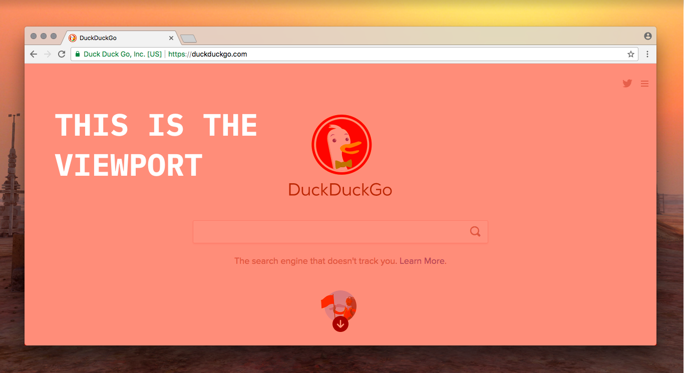
vw & vh
vw and vh stand for viewport width and viewport height. As I’ve explained previously, the viewport is the browser window (not including the tabs etc.) - the actual website part of the screen:
1vw is 1% of the viewport width, and 1vh is 1% of the viewport height. Let’s try it out!
#demo {
    background-color: cyan;
    height: 75vh; /* Change this line */
    width: 50vw; /* Add this line */
    font-size: 2em;
}
Result:
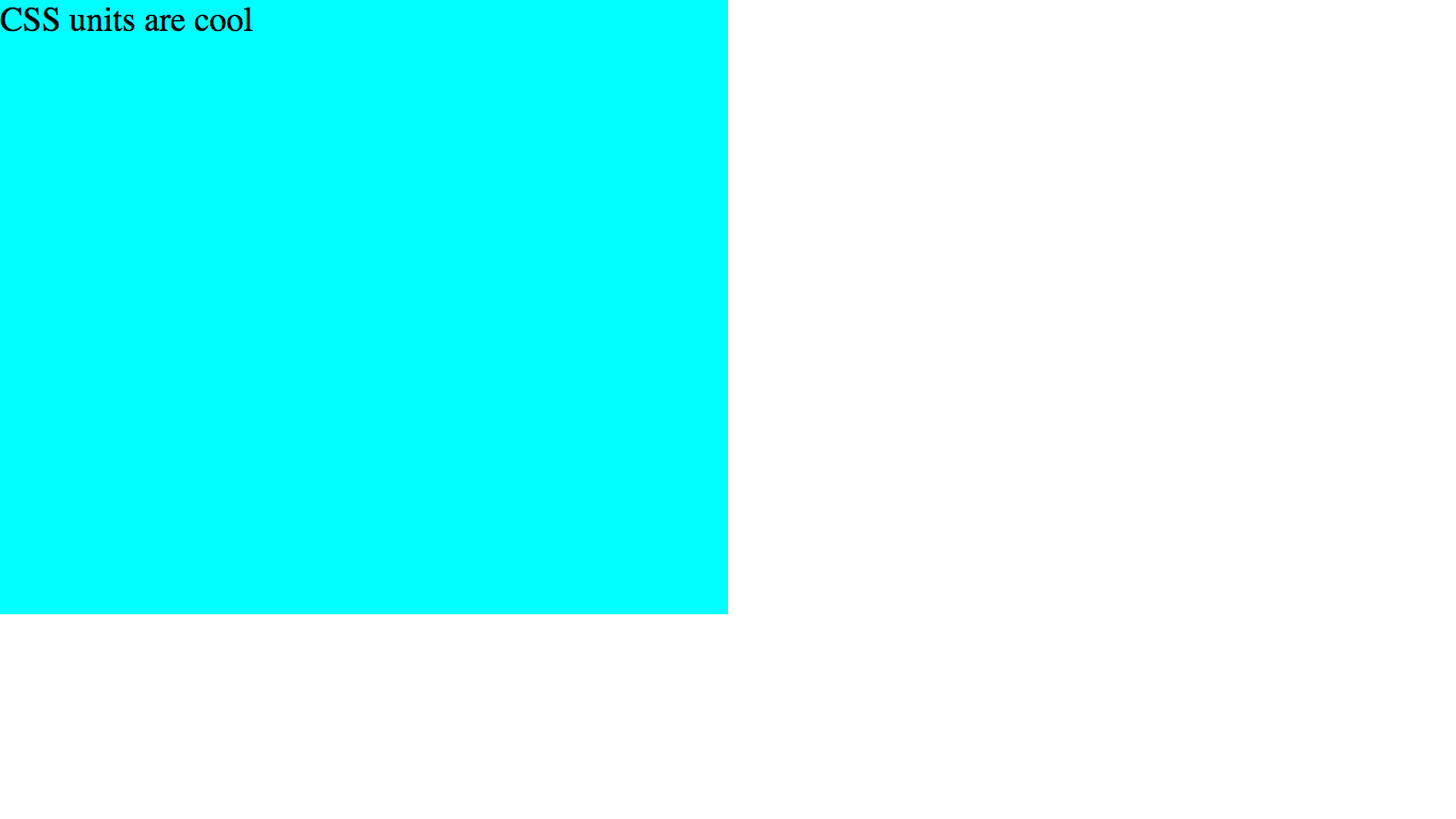
As you can see, the <div> takes up 50% browser window width and 75% of the browser window height.
vw and vh can be especially useful when making elements cover the entire screen. Let’s try it! See if you can guess the code:
#demo {
    background-color: cyan;
    height: 100vh; /* Change this line */
    width: 100vw; /* Change this line */
    font-size: 2em;
}
Result:
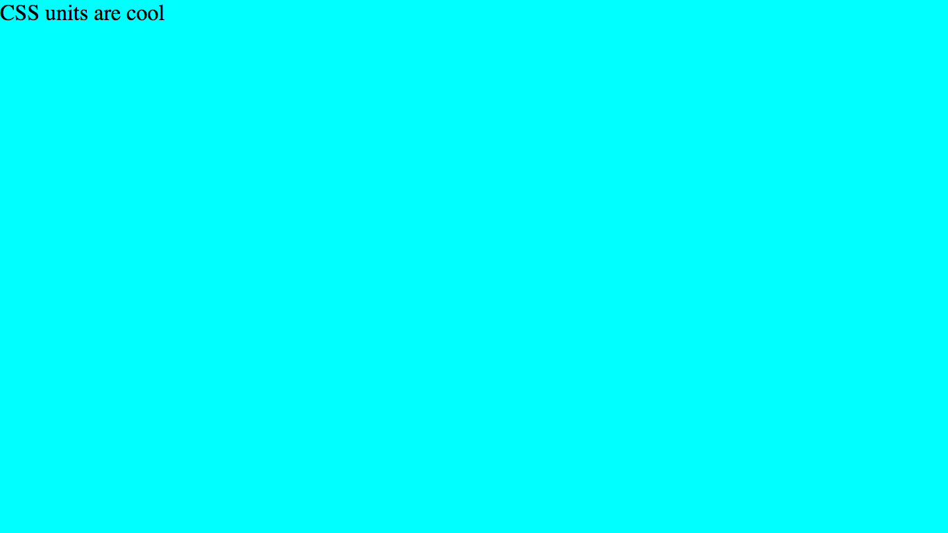
Woo! The <div> now takes up the entire screen! This is one common use for vw and vh, although there are many more.
percent (%)
We’re on the home stretch, this is the last unit I’ll be covering in this article. % means the percentage of the parent element. For example, 200% width is 2x the width of the parent element, while 200% font-size is 2x the font-size of the parent element.
So why can’t we just replace 100vw and 100vh with 100%? Well, let’s try it out:
#demo {
    background-color: cyan;
    height: 100%; /* Change this line */
    width: 100%; /* Change this line */
    font-size: 2em;
}
Result:

No! The height is back to normal! Why is this?
Well, you have to be careful when using height: 100%. As you know, it means 100% of the parent element (in this case the <body>). You are probably assuming that the <body> takes up the whole screen - but actually, it does not!
By default, the dimensions of the <body> element (or any element) are set to auto. This means that they only take up as much room as their contents. So, our body is not 100% of the screen height and instead is set to the height of its contents (the <div>). However, we want the <div> to take up 100% of the <body>! This means that it actually just takes up 100% of its own default height.
The reason why the width isn’t affected is that the <div> has a display type of block, and block elements always take up the maximum width available (in this case the entire screen).
To fix the height problem, we can give the body a fixed height:
body {
    margin: 0;
    height: 100vh; /* Add this line */
}

#demo {
    background-color: cyan;
    height: 100%;
    width: 100%;
    font-size: 2em;
}
Result:
Now, the <div> is taking up 100% of the <body>’s height (100vh).
I will go much further into CSS inheritance in a later article.
Conclusion
Woo! Hopefully, you learned a lot today (if you did you can tell me in the comments).
If you liked this article, I’d love it if you shared it or signed up to the newsletter. Making a blog takes a lot of time and effort, and I’d really appreciate if you helped out!
If you have questions or feedback about this article or need some coding help, you can contact me or tell me in the comments below.
Next time I’ll be talking about flexboxes, which is one of the coolest parts of CSS (in my opinion 😉).
See you then, keep on coding, and have an awesome day!