Flexboxes are something that every web developer should know. They let you align, position and even re-order elements, using CSS alone! It is revolutionary, and lets us do some really cool stuff…
Getting started
By following along, you will end up grasping this topic much better (and can also experiment!). To follow along, start by making a new project folder with index.html and style.css files in it. Add the following code to your index.html:
<!DOCTYPE html>
<html>
    <head>
        <title>CSS flexboxes DEMO</title>
        <link rel="stylesheet" href="style.css">
    </head>
    <body>
        <div id="wrapper">
            <div class="inner_div" id="div1">Div 1</div>
            <div class="inner_div" id="div2">Div 2</div>
            <div class="inner_div" id="div3">Div 3</div>
        </div>
    </body>
</html>
After that, add the following code to your style.css file:
body {
    margin: 0;
}

#wrapper {
    background-color: deepskyblue;
    height: 50vh;
}

.inner_div {
    background-color: whitesmoke;
    padding: 15px;
    border: 2px solid black;
    width: 50px;
    height: 50px;
}
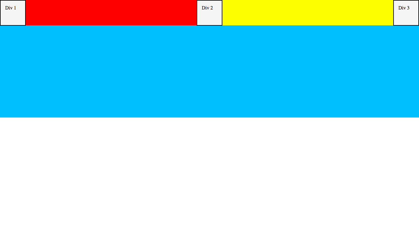
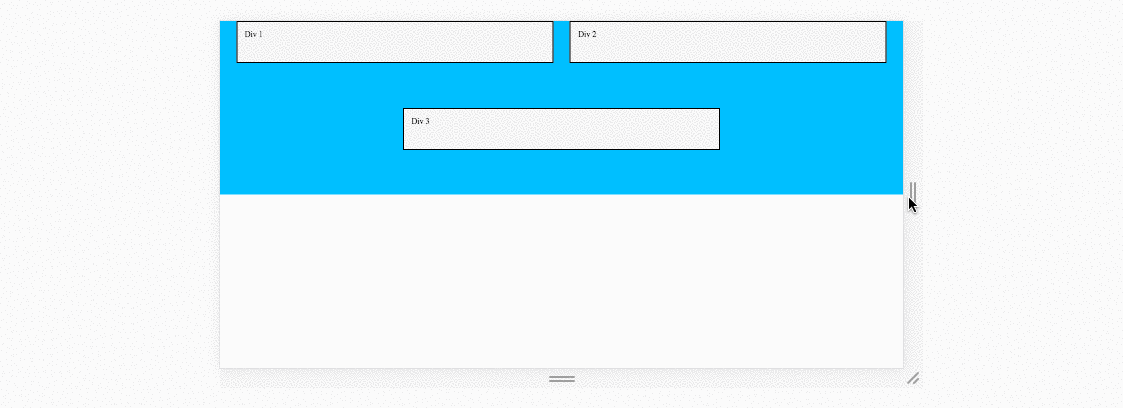
Hopefully you should understand most (if not all) of this. First, we set the <body> margin to 0 - this is because the <body> has a default margin that can mess with positioning and sizing. After that we give our wrapper div> a background-color, and set its height to 50vh. This means that it will take up 50% of the screen height.
Finally, we give each div inside the wrapper a background-color (so we can see them), some padding (for my sanity), a border (so we can see where their edges are) and a width and height.
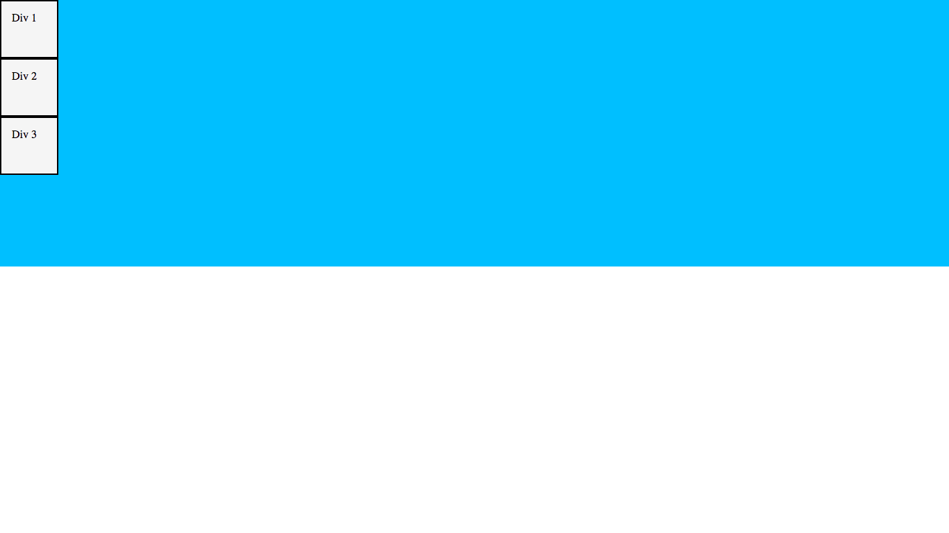
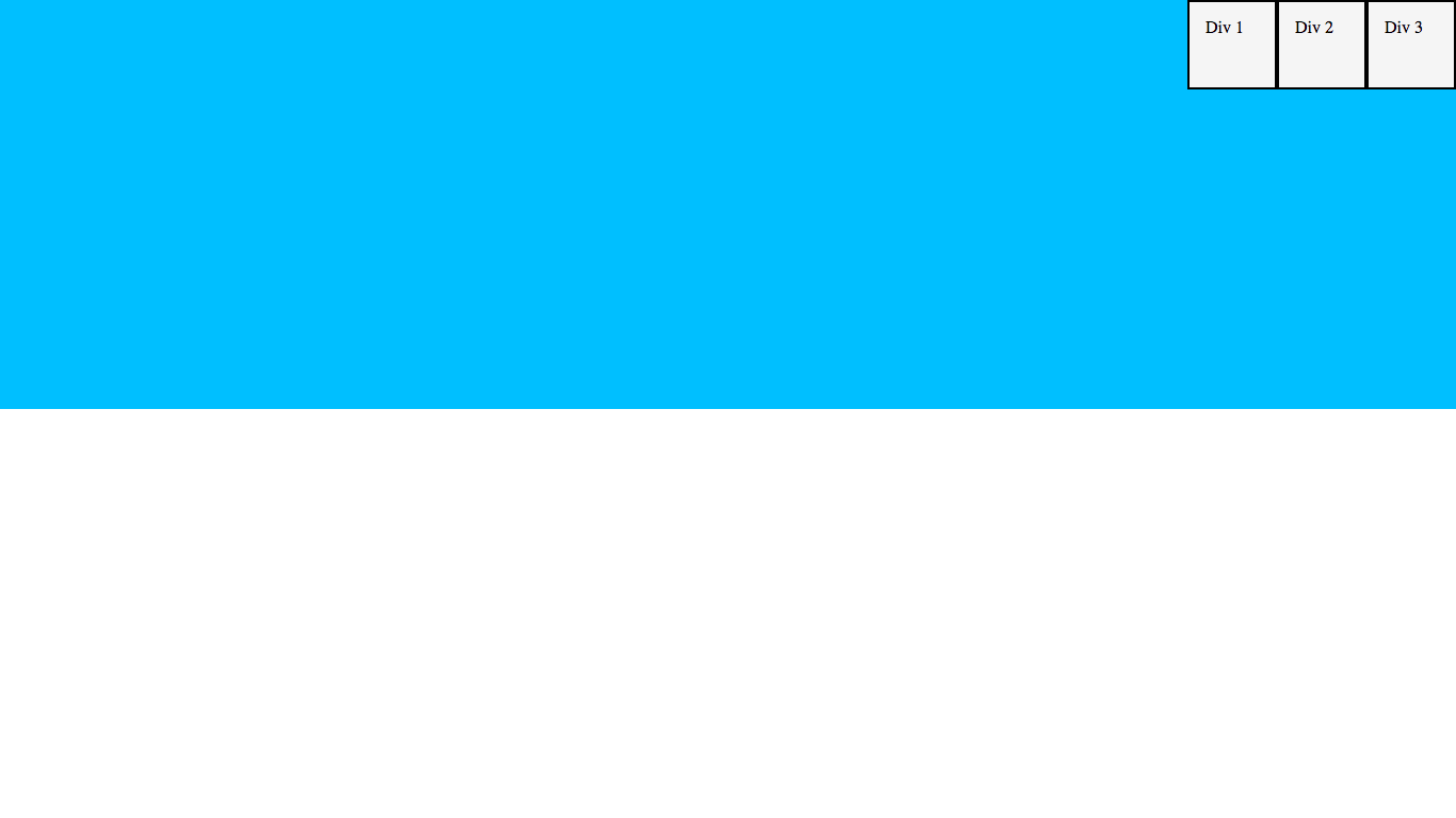
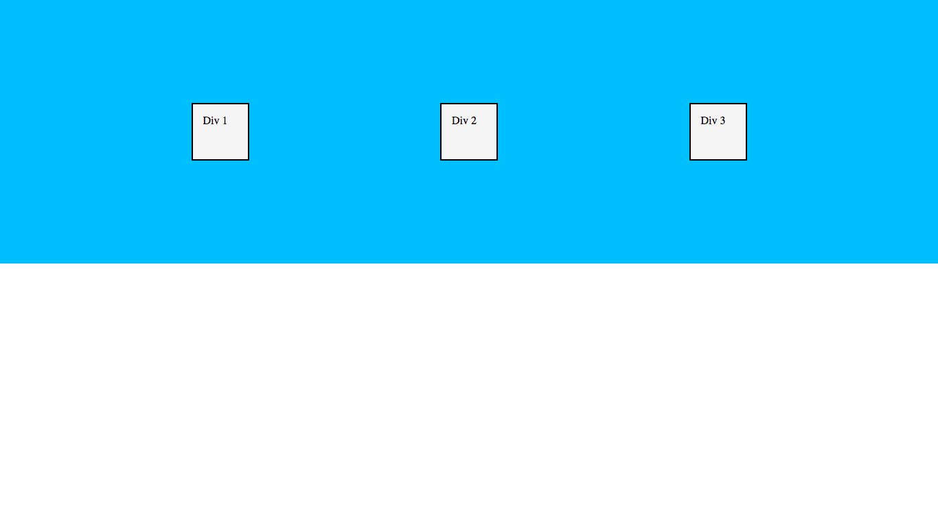
Save your files, and open your index.html in a browser. If everything is working, it should look like this:
Okay, let’s get on to the fun part!
What is a flexbox?
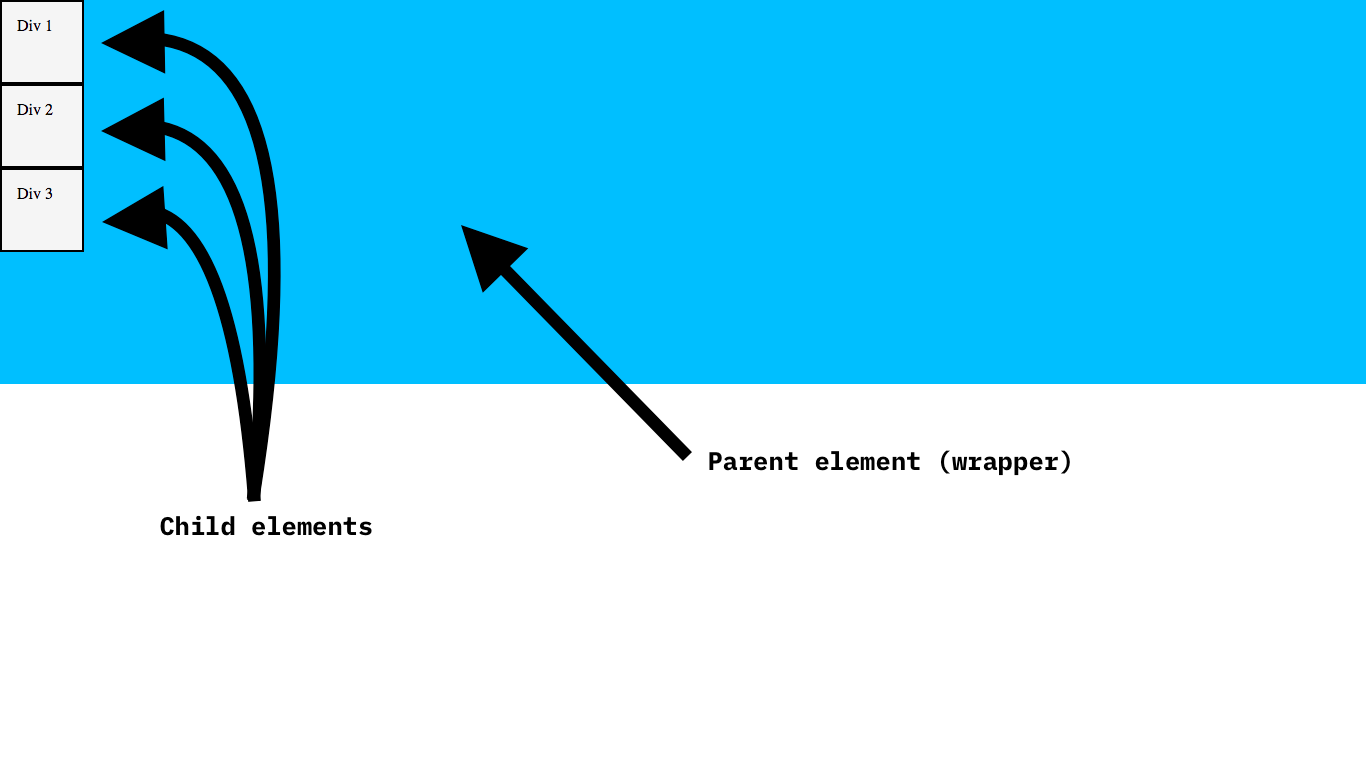
A flexbox is made up of a parent element (which in our case is <div id="wrapper">) with at least one child element inside it.
Creating a flexbox
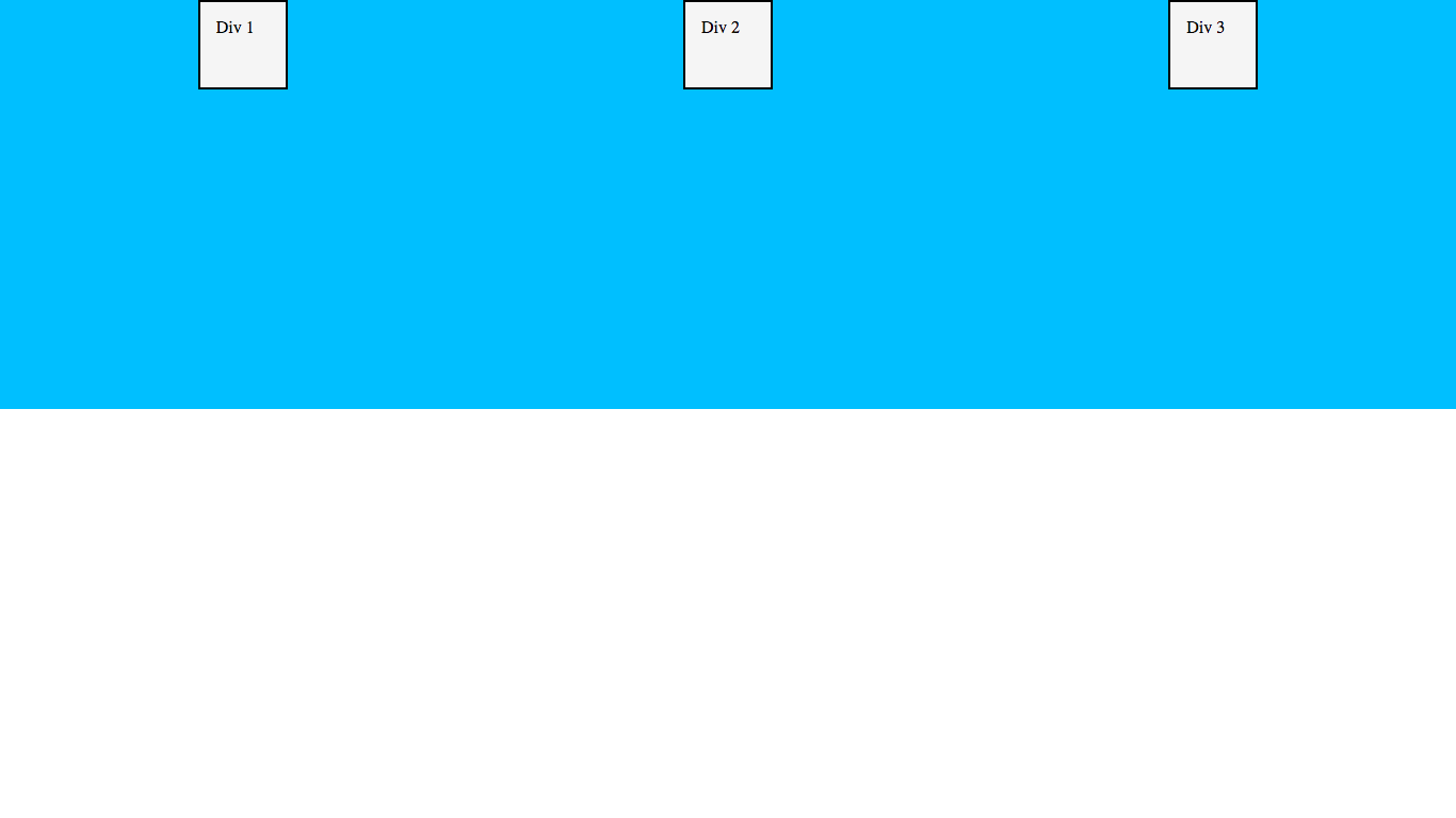
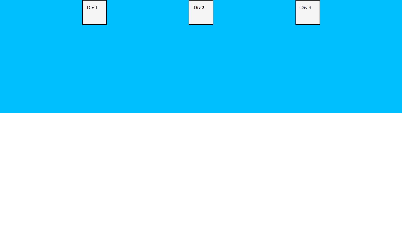
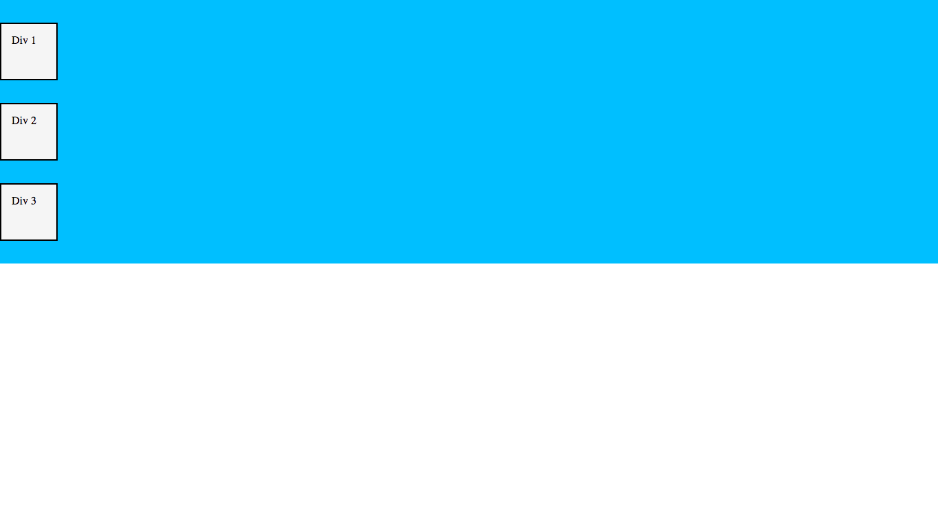
The thing is, our wrapper is actually not a flexbox yet! We need to tell the browser to make it a flexbox using display: flex. Let’s do so in our CSS:
#wrapper {
    background-color: deepskyblue;
    height: 50vh;
    display: flex; /* Add this line */
}
Result:
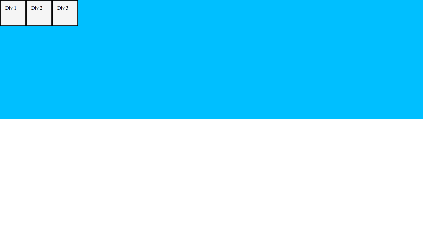
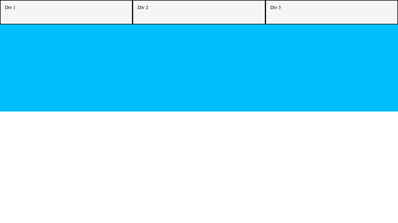
As you can see, the elements have now been ordered horizontally instead of vertically! By default, children of a flexbox are ordered horizontally unless otherwise specified (we’ll get into this further down).
There we go! Now we’ve created a flexbox! Let’s start doing stuff with it…
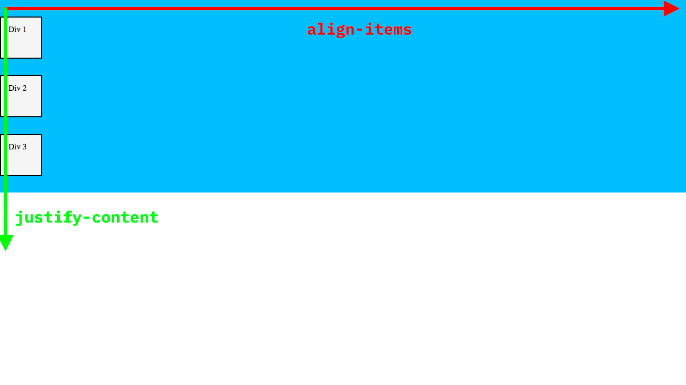
The justify-content property
The justify-content property is used to horizontally align the items within the flexbox. Let’s take a look at the values and what they do…
justify-content: center
justify-content: center does exactly what you think - it centers all the items within the flexbox. Let’s try it out:
#wrapper {
    background-color: deepskyblue;
    height: 50vh;
    display: flex;
    justify-content: center; /* Add this line */
}
Result:
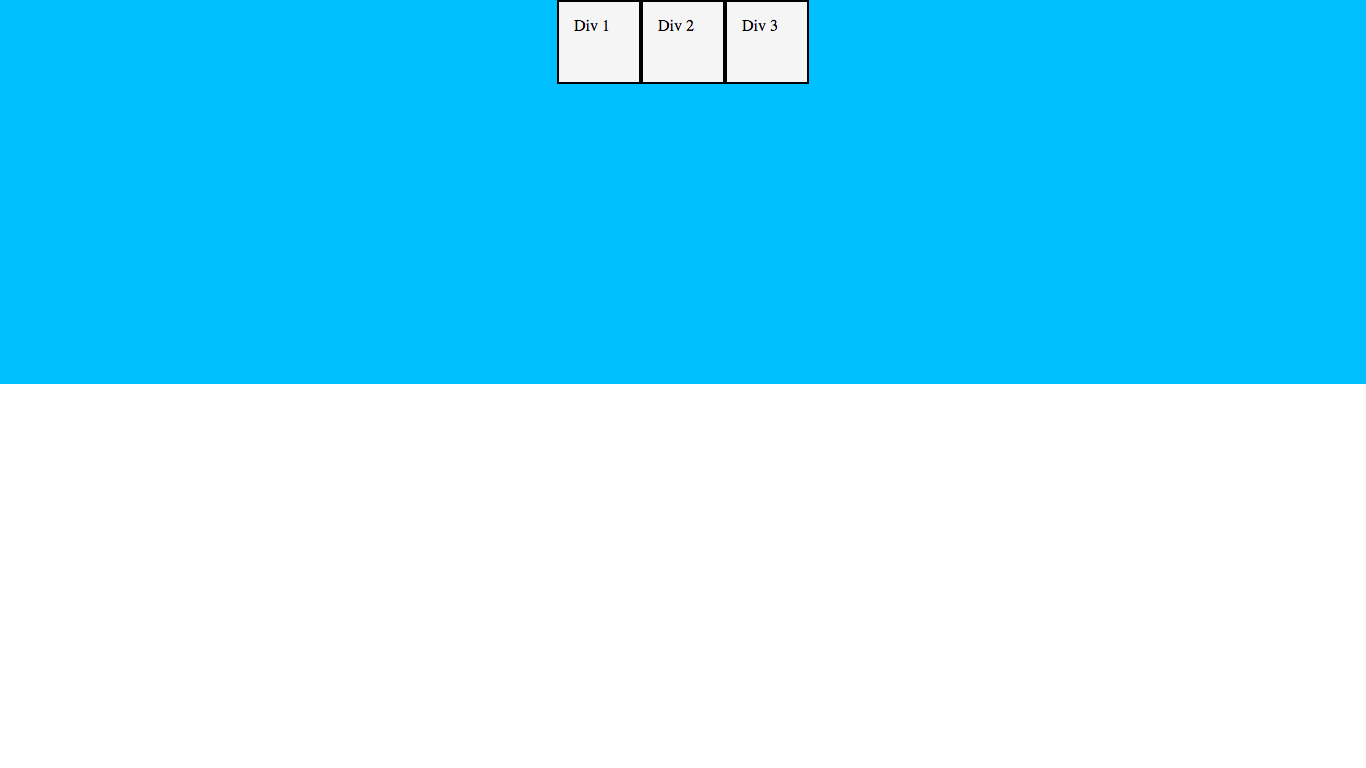
It’s that simple!
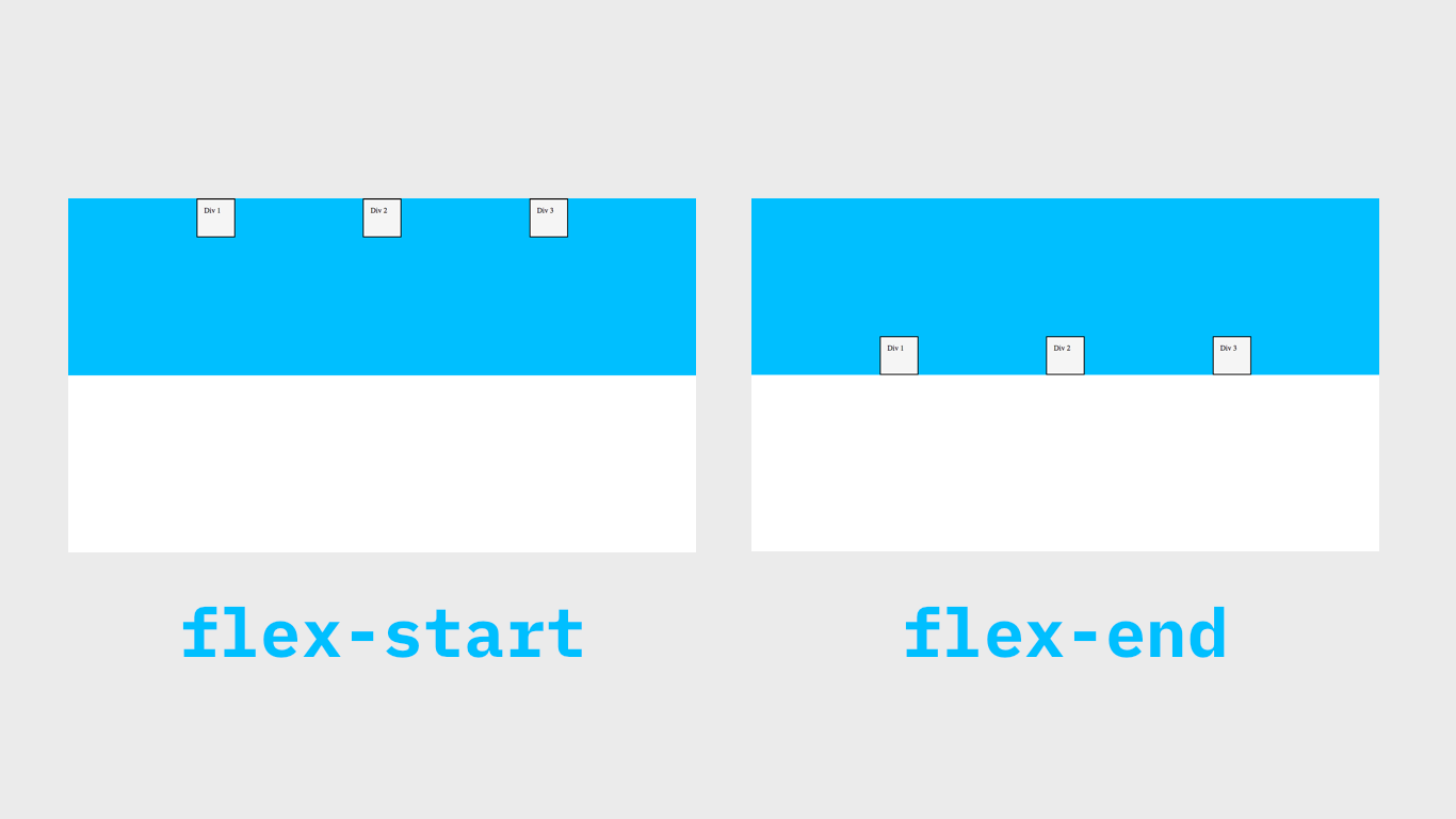
justify-content: flex-start
justify-content: flex-start aligns the items to the left of the flexbox. Let’s try it out:
#wrapper {
    background-color: deepskyblue;
    height: 50vh;
    display: flex;
    justify-content: flex-start; /* Change this line */
}
Result:
As you can see, the items are now aligned to the left edge of the flexbox (the ‘start’ of the flexbox, hence the name flex-start).
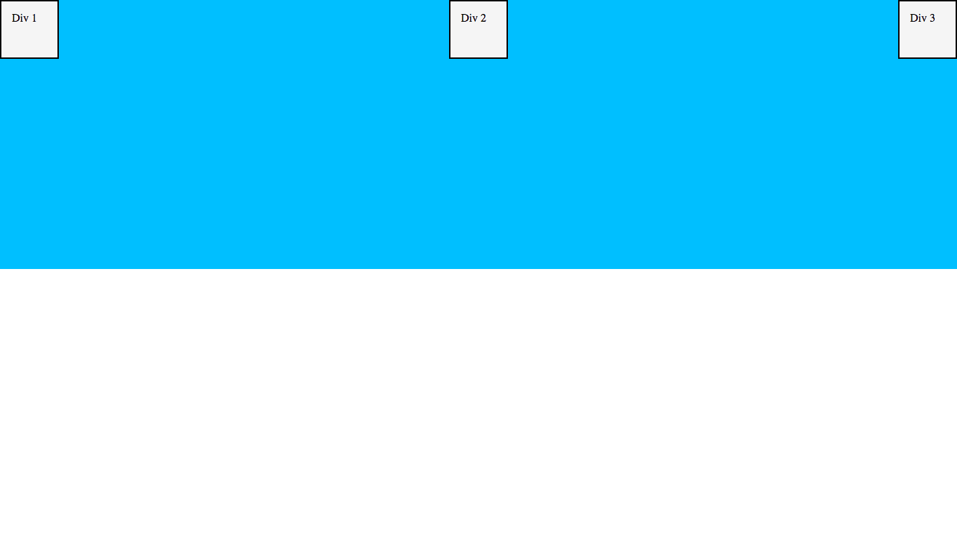
justify-content: flex-end
justify-content: flex-end is the same as flex-start, except it aligns the items to the right edge (the ‘end’ of the flexbox). Let’s update our CSS and see what happens:
#wrapper {
    background-color: deepskyblue;
    height: 50vh;
    display: flex;
    justify-content: flex-end; /* Change this line */
}
Result:
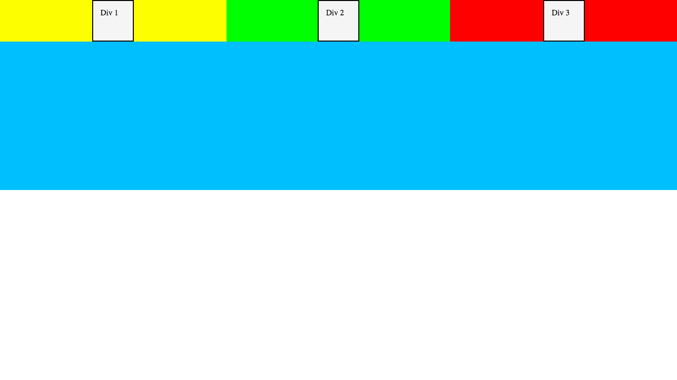
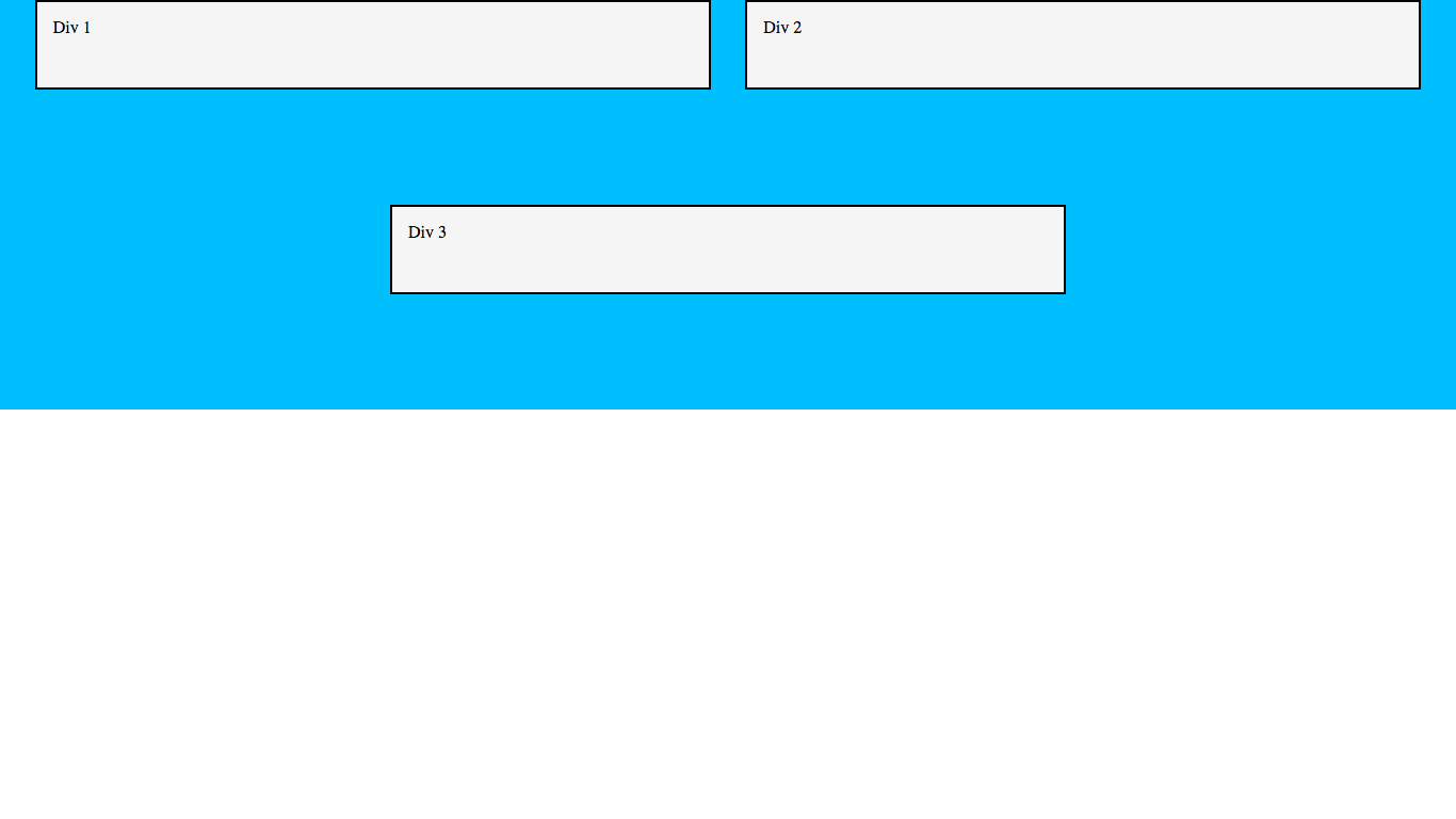
justify-content: space-around
justify-content: space-around spaces the items in the flexbox so that each item has the same amount of space around it. Let’s try it out to get a better understanding:
#wrapper {
    background-color: deepskyblue;
    height: 50vh;
    display: flex;
    justify-content: space-around; /* Change this line */
}
Here is a diagram so you can visualize the spacing easier - you will see that there is the same amount of space surrounding each item:
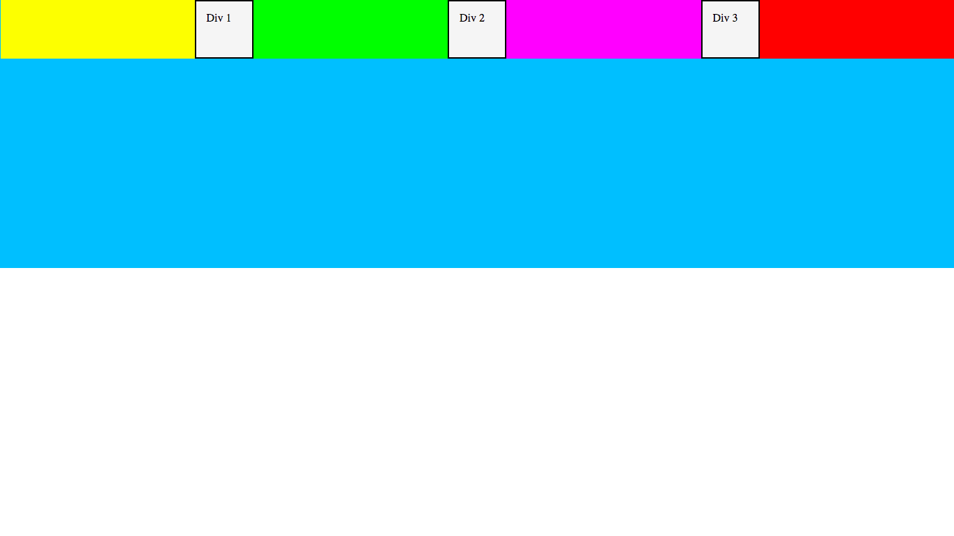
justify-content: space-between
justify-content: space-between spaces the items with an even amount of space between them instead of with an even amount of space around them. This can seem confusing at first, but once we try it the difference is clear. So, let’s try it and see:
#wrapper {
    background-color: deepskyblue;
    height: 50vh;
    display: flex;
    justify-content: space-between; /* Change this line */
}
Result:
As you can see there is a big difference between space-around and space-between! This diagram will help you visualize how space-between is different:
Now the space between the items is equal, but not the space around each one.
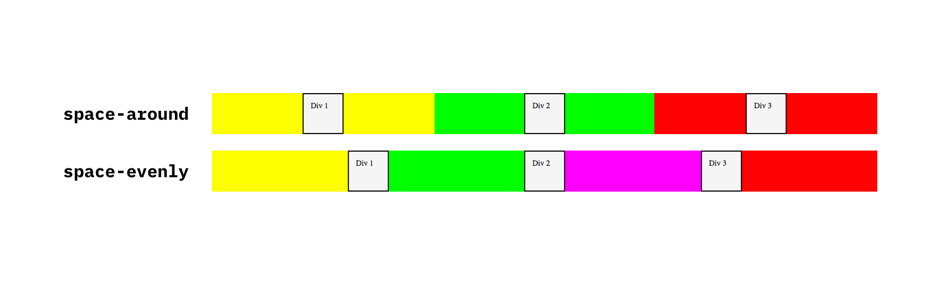
justify-content: space-evenly
Really? Another one of those space properties? Yep, that’s right - justify-content: space-evenly is like space-between, but includes the sides. This means that the space between each item is the same, but is also the same as the space between the outer items and the edges. Let’s try it and see what happens:
#wrapper {
    background-color: deepskyblue;
    height: 50vh;
    display: flex;
    justify-content: space-evenly; /* Change this line */
}
Result:
As you can see, the spaces between each item as well as the spaces between the items and the edges are equal. This diagram will (hopefully) clear things up a bit:
Although it may look deceptively like space-around, it is actually not. Here is a comparison of their spacing:
Phew! That’s all the stuff on justify-content done - hopefully it wasn’t too confusing! While there is still more to cover in this article, don’t worry - it’s not all this complicated! Let’s move on to something different now…
NOTE: There are more values for
justify-content, but these are the only ones that you really need to care about.
The align-items property
The align-items property is used to align the items vertically within the flexbox. It accepts the values of center, flex-start and flex-end. You already know what these do! However, note that because it is vertical, flex-start is aligned to the top instead of the left, and flex-end is aligned to the bottom instead of the right. Let’s try one out:
#wrapper {
    background-color: deepskyblue;
    height: 50vh;
    display: flex;
    justify-content: space-evenly;
    align-items: center; /* Add this line */
}
Result:
And here is what flex-start and flex-end look like:
Just keep in mind that you cannot use space-around, space-between and space-evenly as values for the align-items property.
NOTE: There are more values for
align-itemsas well, but these are the only ones that you really need to care about.
Perfect centering!
In the dark old days before flexboxes, centering something both vertically and horizontally was a pain, and required ugly hacks. Luckily, now its as simple as giving the parent three lines of CSS!
(don’t add this to your current CSS file, but you can play around later if you want 😉)
#parent {
    display: flex;
    justify-content: center;
    align-items: center;
}
This is just one of the many awesome uses for flexboxes.
Moving on!
The flex-wrap property
What happens if your items are wider and can’t all fit on one line? Let’s have a look - change the width of .inner_div to 600px:
.inner_div {
    background-color: whitesmoke;
    padding: 15px;
    border: 2px solid black;
    width: 600px; /* Change this line */
    height: 50px;
}
Result:
As you can see, the items all stay on the one line and take up the maximum width that they are allowed to (only 422px, which is a lot less than 600px!).
NOTE: These dimensions might be different based on your screen width.
Heck, you can even set the width to 100000000px and it will still take up the same amount of space! (you can try if you’re not convinced).
If we want to make the items go onto a new line if they are too big, we can use the flex-wrap property - try it out!
(if you set the width to 100000000px, change it back to 600px first)
#wrapper {
    background-color: deepskyblue;
    height: 50vh;
    display: flex;
    justify-content: space-evenly;
    align-items: center;
    flex-wrap: wrap; /* Add this line */
}
Result:
As you can see, the items are now bigger (their actual size, 600px).
flex-wrap also allows us to create layouts that adapt to multiple screen sizes - this is called responsive design. Take a look:
This way, the items never resize weirdly or go off the edge of the screen.
Back to normal…
Before continuing, let’s put our demo back to normal:
body {
    margin: 0;
}

#wrapper {
    background-color: deepskyblue;
    height: 50vh;
    display: flex;
    justify-content: space-evenly;
    align-items: flex-start;
    /* Remove the flex-wrap line */
}

.inner_div {
    background-color: whitesmoke;
    padding: 15px;
    border: 2px solid black;
    width: 50px; /* Change this back to 50px */
    height: 50px;
}
The flex-direction property
The whole time our items have been going horizontally. But what if we wanted to make them go vertically?
This is what the flex-direction property is for. Let’s try making our items go vertically…
#wrapper {
    background-color: deepskyblue;
    height: 50vh;
    display: flex;
    justify-content: space-evenly;
    align-items: flex-start;
    flex-direction: column; /* Add this line */
}
Result:
There is a massive thing that you need to remember though - When using flex-direction: column, justify-content and align-items are reversed. Here is a diagram:
This is very confusing! However, you will just have to get used to it - just remember that when you rotate the direction, you rotate the properties as well.
The order property
First of all, remove your
flex-direction: columnline - it will get in the way for demoing this property:#wrapper { background-color: deepskyblue; height: 50vh; display: flex; justify-content: space-evenly; align-items: flex-start; /* Remove the flex-direction line */ }
Okay, let’s get going… This is our final property for today!
Remember at the start of the article how I mentioned that you can actually re-order HTML elements using CSS flexboxes? Well, this is how. It is revolutionary to be able to re-order elements - previously, you had to do some ugly position hacks that could break easily under certain conditions. So, how do we do it?
Unlike the other properties so far, the order property applies to the actual items, instead of the parent wrapper. The order property takes any integer as a value.
When ordering items in a flexbox, each item has a position. The first item is at position 0, the second is at position 1 etc. (most lists in programming start at 0 instead of 1)
Let’s try and make the order become Div 2, Div 1, Div 3. Here’s how we can do this:
#div1 {
    order: 1;
}
#div2 {
    order: 0;
}
#div3 {
    order: 2;
}
Result:
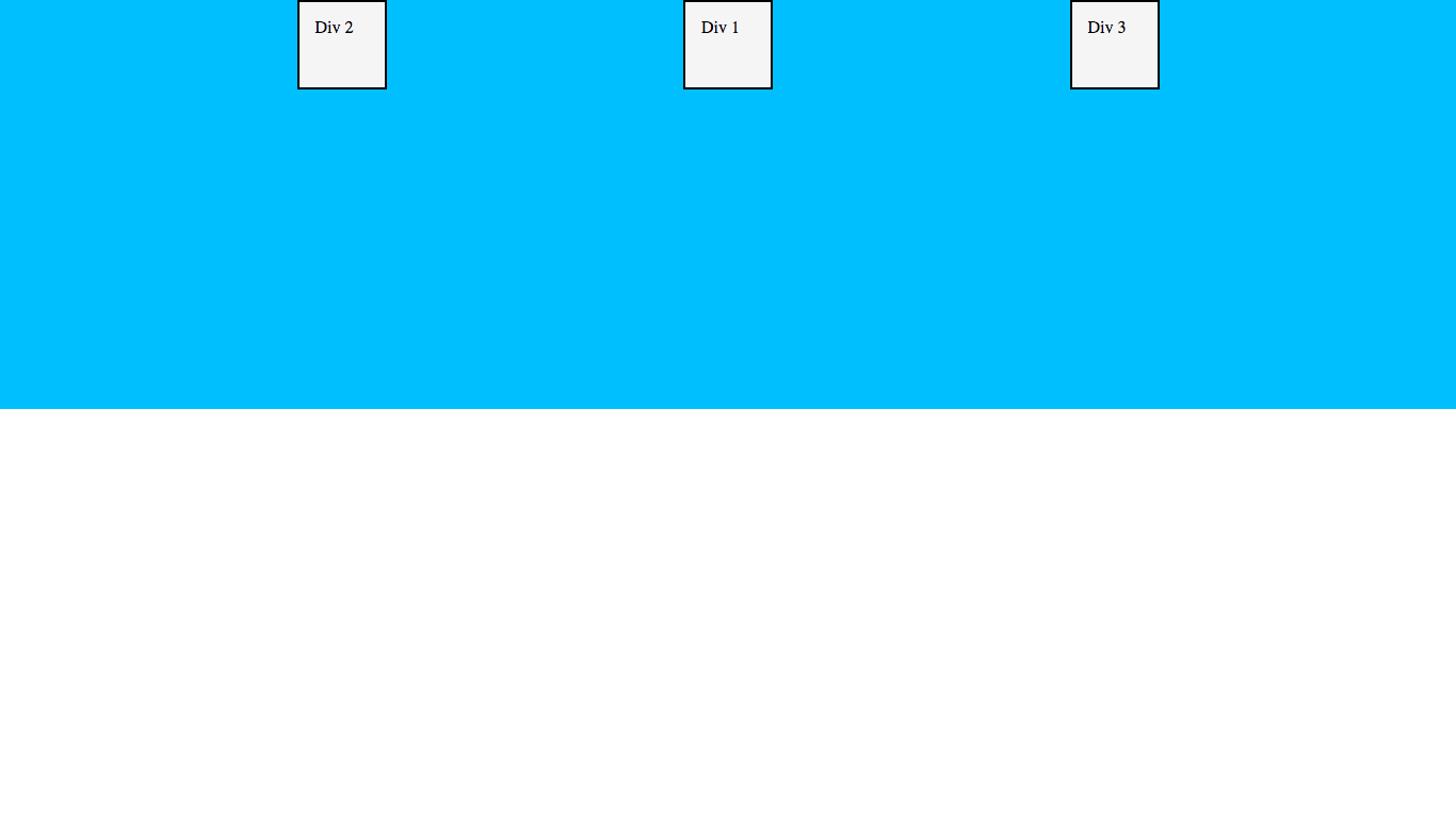
Yay! Now our order has been changed! This is the beauty of the order property - it can change the order of the elements on the screen, using only CSS!
You can play around with the order a bit more now if you want.
Game Time! 🕹🕹🕹 🐸
If you want to reinforce what you’ve learned today and have a bit of geeky fun, I highly recommend you go and play Flexbox Froggy. There are 24 levels where you have to position frogs onto their correct lilypads using CSS flexboxes. It was actually one of the first places that I found out about flexboxes when I was learning, and it was really helpful.
Also, if you want to see some things that are possible with flexboxes, take a look at these flexbox examples.
But don’t go yet! We still need to do the conclusion bit where I ask you to be nice and share this and congratulate you even though I probably don’t actually know you!
Conclusion
Well done! This was a long article today because there was a lot to cover. Hopefully, you found it useful! If you did, I’d really love it if you shared the article or signed up to the newsletter to receive new posts in your inbox. If you do any of these things, you’re officially awesome and deserve a taco 🌮 🌮 🚀
IMPORTANT NOTE: Don’t forget that all of the properties we learn today only work with flexboxes. So don’t try going and using them anywhere else 😉
If you have any feedback, questions, need help or just want to say hi, do so in the comments below and I’ll reply to you!
See you next time, where I’ll be doing a special article on how to make a full-page hero image, using some of the things that we learned today (hint hint perfect centering 😉)
Keep coding, have an awesome day, and see you then!
and don’t forget about Flexbox Froggy 🐸 😉