You can find navigation bars on almost any website on the internet. Learn how to code and style one in this article!
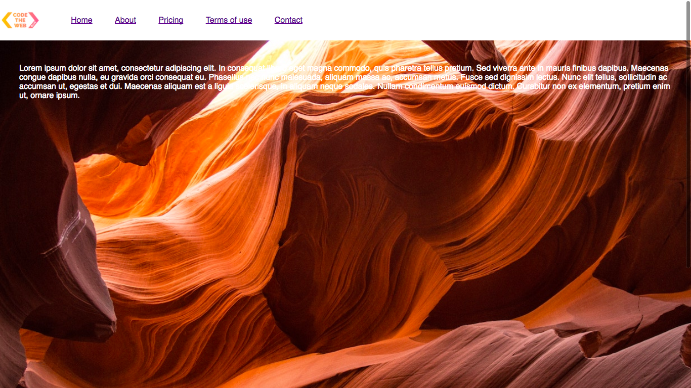
The final product
Here is what we’ll be making today:

Terminology
Lol, this sounds like the start of a legal agreement 😂
For the purposes of this article, a navigation bar (nav-bar) is the same thing as a header. I’ll be using the term “nav-bar” in this article, but just know that they are basically the same.
Getting started
I recommend that you follow along in each of my tutorials - it will really help you learn and grasp the concepts faster. Especially in tutorials like this, it will be fun to code along.
To get started, create a new project folder and create blank index.html and style.css files inside. Let’s get going and fill them up!
The HTML
As you know, the HTML is the start of any website. Add the following to your index.html file:
<!DOCTYPE html>
<html>
    <head>
        <title>Navigation bar DEMO</title>
        <link rel="stylesheet" href="style.css">
    </head>
    <body>
        <header>
           <img src="https://codetheweb.blog/assets/img/icon2.png">
            <nav>
                <ul>
                    <li><a href="#">Home</a></li>
                    <li><a href="#">About</a></li>
                    <li><a href="#">Pricing</a></li>
                    <li><a href="#">Terms of use</a></li>
                    <li><a href="#">Contact</a></li>
                </ul>
            </nav>
        </header>
        <main>
            <p>Lorem ipsum dolor sit amet, consectetur adipiscing elit. In consequat libero eget magna commodo, quis pharetra tellus pretium. Sed viverra ante in mauris finibus dapibus. Maecenas congue dapibus nulla, eu gravida orci consequat eu. Phasellus nec nunc malesuada, aliquam massa ac, accumsan metus. Fusce sed dignissim lectus. Nunc elit tellus, sollicitudin ac accumsan ut, egestas et dui. Maecenas aliquam est a ligula scelerisque, in aliquam neque sodales. Nullam condimentum euismod dictum. Curabitur non ex elementum, pretium enim ut, ornare ipsum.</p>
        </main>
    </body>
</html>
Inside the body, we have the header and navigation elements. If you are not familiar with this structure of a navigation bar in HTML, take a look at this article.
Below the header, we have some dummy text inside the <main> element. This is so that we can see problems that will arise later in the tutorial.
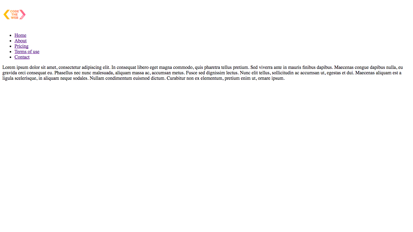
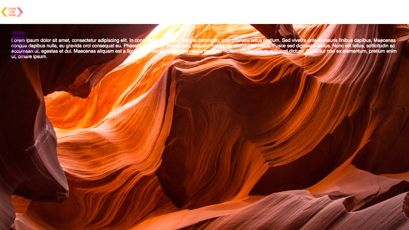
Open up your index.html file in a browser - at this point, it should look like so:

Note that you will probably have to scroll down unless you are reeeaaaally zoomed out because our image is massive!
Time for our CSS…
The basic CSS
First of all, our image is waaaaaay too big. Let’s shrink it down to a height of 80px - this will be the height of our nav-bar. Add the following to your style.css file:
header img {
    height: 80px;
}
Result:
Phew, I can breathe now 😅
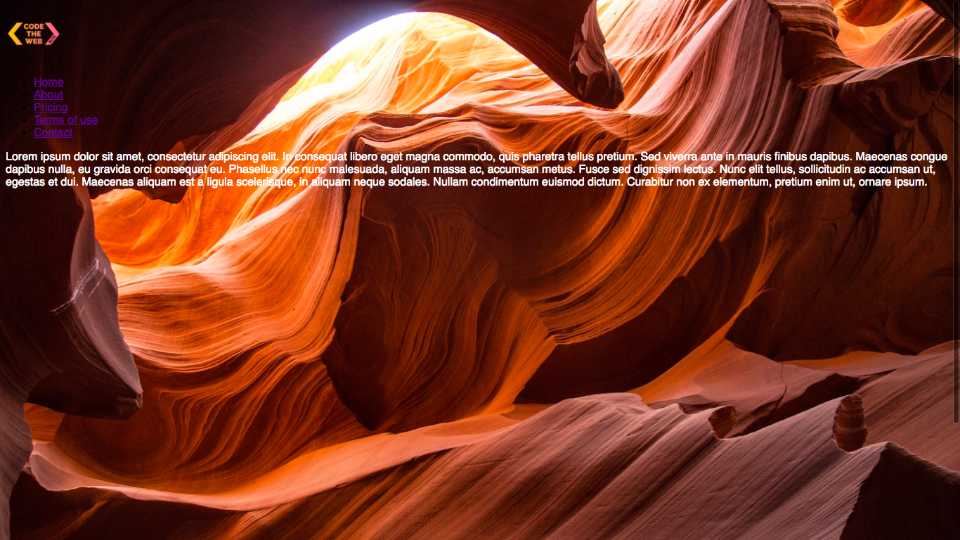
Next, let’s set our styling up so we will be able to see what’s going on. First of all, we want to be able to scroll - we can do this by setting the <body> height to 125vh (viewport height). We want to be able to see when we are scrolling down, and we can do this by adding a background-image. While we’re at it, let’s set our font to sans-serif so it doesn’t look as terrible. Here’s the CSS:
header img {
    height: 80px;
}
body {
    height: 125vh;
    background-image: url('https://codetheweb.blog/assets/img/posts/style-a-navigation-bar-css/background.jpg');
    background-size: cover;
    font-family: sans-serif;
}
One more thing, let’s add a color to our <main> so that we can see the dummy text better:
header img {
    height: 80px;
}
body {
    height: 125vh;
    background-image: url('https://codetheweb.blog/assets/img/posts/style-a-navigation-bar-css/background.jpg');
    background-size: cover;
    font-family: sans-serif;
}

main {
    color: white;
}
Here’s the result of all that:
Don’t worry about changing the colors of the links because we will be styling those later anyway.
Positioning the nav-bar
Okay, now our website is looking alright - but not our nav-bar! It still looks like a list, because whenever you make a navigation bar, it has to have a specific structure (the one containing an <ul>). This is because it is easier for web crawlers to navigate, and also Google will like you 😉
First of all, let’s start by positioning the actual <header> element. We’ll also want to give the <header> a background-color so that we can see its position. Let’s add some styles!
header img {
    height: 80px;
}
body {
    height: 125vh;
    background-image: url('https://codetheweb.blog/assets/img/posts/style-a-navigation-bar-css/background.jpg');
    background-size: cover;
    font-family: sans-serif;
}

main {
    color: white;
}

header {
    background-color: white;
    position: fixed;
    top: 0;
    left: 0;
    right: 0;
    height: 80px;
}
Here’ we’re positioning the <header> element usingposition : fixed. Then, we also set the height to 80px like I mentioned earlier (the only reason that we’re using that specific is because it looks good).
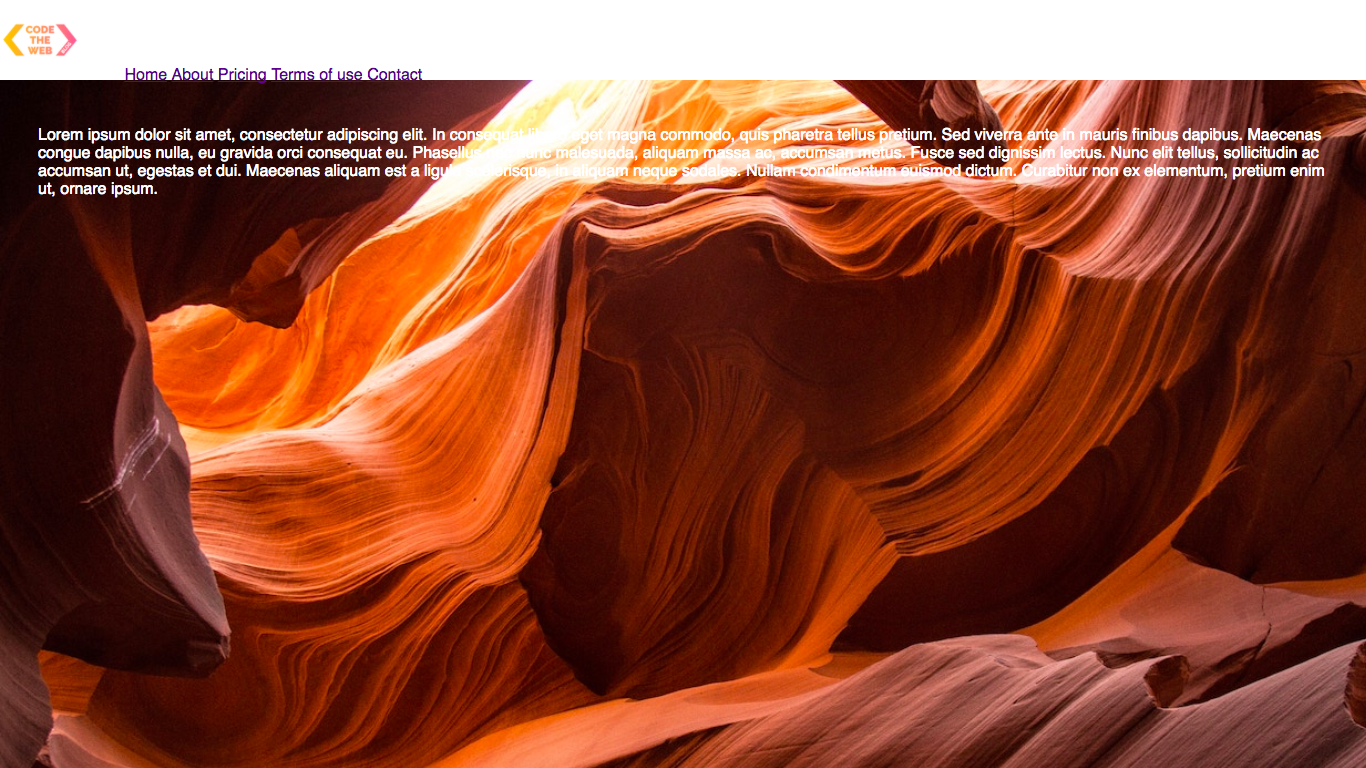
Here is the result:
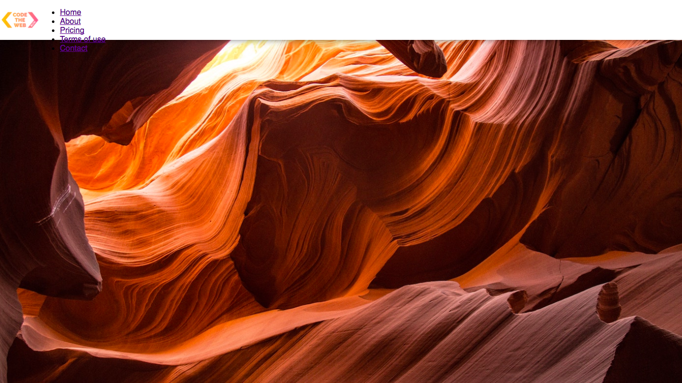
Yay, our header/nav-bar is now positioned! However, the dummy text in the <main> has been obscured 😕
Now that the nav-bar has a position of fixed, the rest of the content on the page moves up. This means that the main text is actually underneath our nav-bar!
To fix this, we simply need to give the body a margin-top equal to the height of the nav-bar, 80px:
header img {
    height: 80px;
}
body {
    height: 125vh;
    background-image: url('https://codetheweb.blog/assets/img/posts/style-a-navigation-bar-css/background.jpg');
    background-size: cover;
    font-family: sans-serif;
    margin-top: 80px;
}

main {
    color: white;
}

header {
    background-color: white;
    position: fixed;
    top: 0;
    left: 0;
    right: 0;
    height: 80px;
}
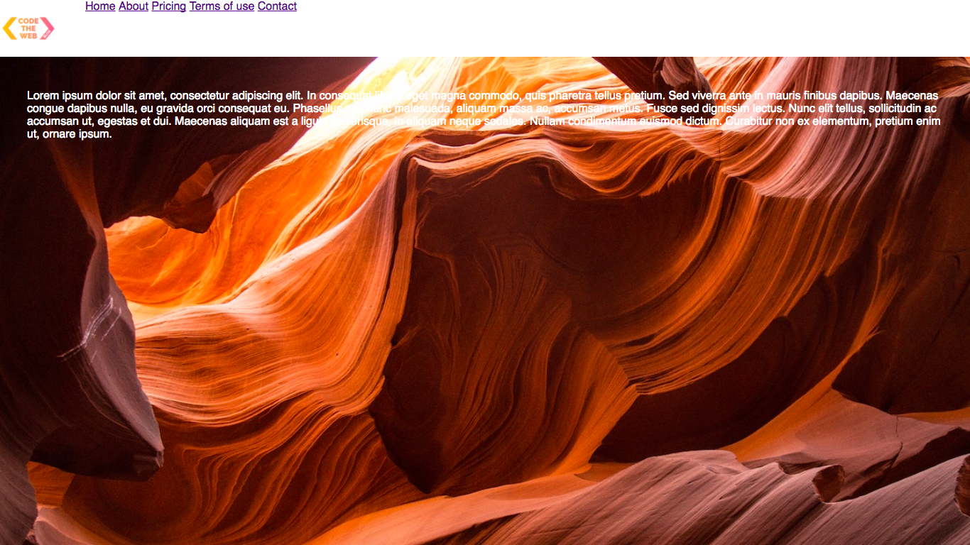
Result:
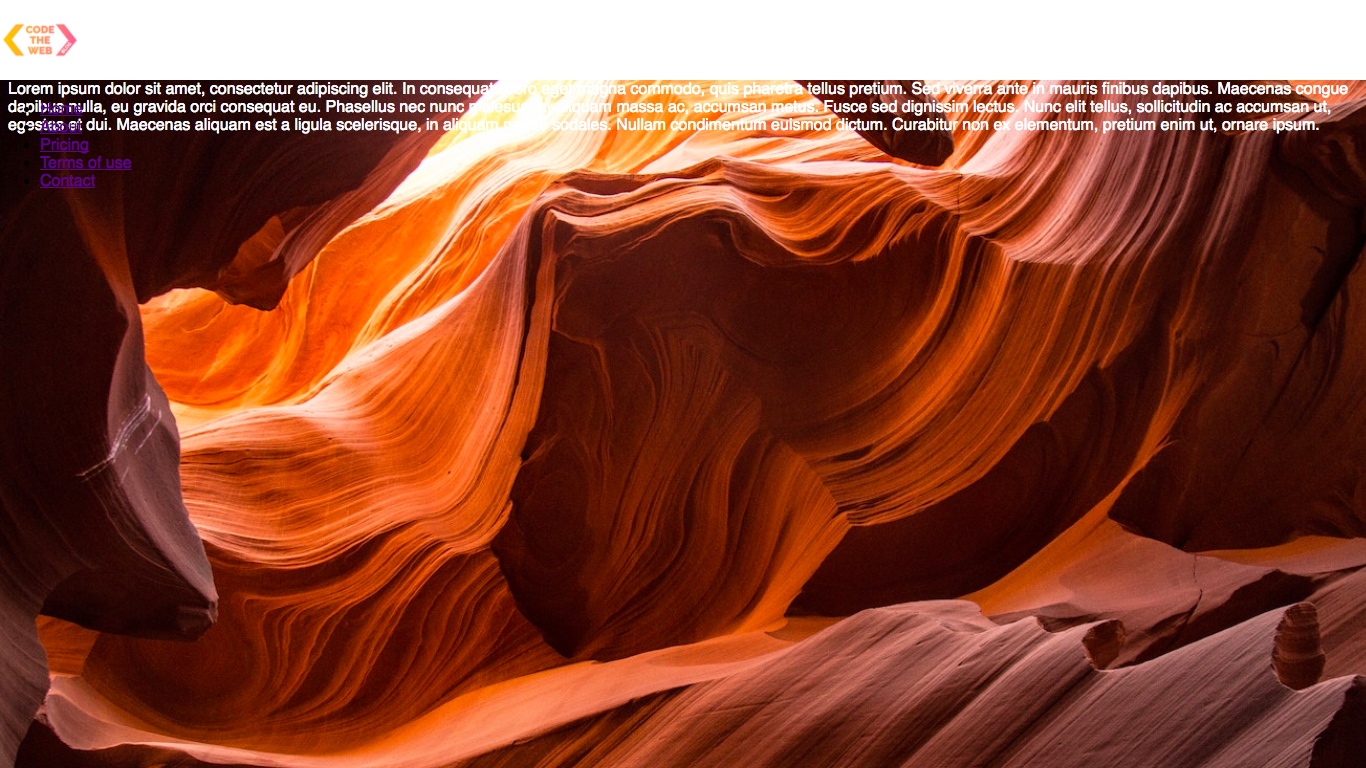
Woo! The only thing is that now the text is right up against the bottom of the nav-bar 😕 Let’s fix it by adding some padding (I totally didn’t mean for that to rhyme 😂) - here is the CSS:
header img {
    height: 80px;
}
body {
    height: 125vh;
    background-image: url('https://codetheweb.blog/assets/img/posts/style-a-navigation-bar-css/background.jpg');
    background-size: cover;
    font-family: sans-serif;
    margin-top: 80px;
    padding: 30px;
}

main {
    color: white;
}

header {
    background-color: white;
    position: fixed;
    top: 0;
    left: 0;
    right: 0;
    height: 80px;
}
Result:
Much better!
Here are the margin and padding of the body visualized:
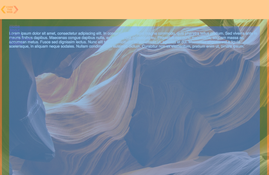
(the margin is orange, the padding is green and the main part of the body is blue)
Congrats, now we’ve got our page pretty much working! However, not the stuff inside the <header> - it is overlapping the rest of the text and looks bad.
Styling the contents of the nav-bar
Now, let’s position the items inside the nav-bar! First of all, we want to make the items go horizontally instead of vertically. We can do this using display: inline:
header img {
    height: 80px;
}
body {
    height: 125vh;
    background-image: url('https://codetheweb.blog/assets/img/posts/style-a-navigation-bar-css/background.jpg');
    background-size: cover;
    font-family: sans-serif;
    margin-top: 80px;
    padding: 30px;
}

main {
    color: white;
}

header {
    background-color: white;
    position: fixed;
    top: 0;
    left: 0;
    right: 0;
    height: 80px;
}

header * {
    display: inline;
}
Here, we are using the selector header *. The * is a wildcard and can mean any element. So header * basically means any element inside the header. Also, note that when we use display: inline, the bullet points go away. The reason that the bullet points appear in the first place is that by default <li> elements have a display type of list-item. So when we override this and change it to inline, the bullet points disappear.
Here is the result:
However, our links now go to the bottom of the nav-bar! We can make them go to the top of the nav-bar by giving our <header> element a display property of flex:
header img {
    height: 80px;
}
body {
    height: 125vh;
    background-image: url('https://codetheweb.blog/assets/img/posts/style-a-navigation-bar-css/background.jpg');
    background-size: cover;
    font-family: sans-serif;
    margin-top: 80px;
    padding: 30px;
}

main {
    color: white;
}

header {
    background-color: white;
    position: fixed;
    top: 0;
    left: 0;
    right: 0;
    height: 80px;
    display: flex;
}

header * {
    display: inline;
}
Result:
However, the text is still not vertically aligned to the middle of the nav-bar. We can vertically align our items in the nav-bar using align-items: center. If you don’t know about display: flex or align-items: center, check out my flexbox tutorial. Here is the CSS:
header img {
    height: 80px;
}
body {
    height: 125vh;
    background-image: url('https://codetheweb.blog/assets/img/posts/style-a-navigation-bar-css/background.jpg');
    background-size: cover;
    font-family: sans-serif;
    margin-top: 80px;
    padding: 30px;
}

main {
    color: white;
}

header {
    background-color: white;
    position: fixed;
    top: 0;
    left: 0;
    right: 0;
    height: 80px;
    display: flex;
    align-items: center;
}

header * {
    display: inline;
}
Result:

However, all the links in the nav-bar are very squished together - we can space them out more by giving them a margin property:
header img {
    height: 80px;
}
body {
    height: 125vh;
    background-image: url('https://codetheweb.blog/assets/img/posts/style-a-navigation-bar-css/background.jpg');
    background-size: cover;
    font-family: sans-serif;
    margin-top: 80px;
    padding: 30px;
}

main {
    color: white;
}

header {
    background-color: white;
    position: fixed;
    top: 0;
    left: 0;
    right: 0;
    height: 80px;
    display: flex;
    align-items: center;
}

header * {
    display: inline;
}

header li {
    margin: 20px;
}
Result:
That looks better! Now that our nav-bar items are positioned, it’s time to give them some styles! We want to take away the ugly default link styles, so let’s go ahead and do that - we can set the color to black and the text-decoration to none (normally it would be underline). Here is the CSS:
header img {
    height: 80px;
}
body {
    height: 125vh;
    background-image: url('https://codetheweb.blog/assets/img/posts/style-a-navigation-bar-css/background.jpg');
    background-size: cover;
    font-family: sans-serif;
    margin-top: 80px;
    padding: 30px;
}

main {
    color: white;
}

header {
    background-color: white;
    position: fixed;
    top: 0;
    left: 0;
    right: 0;
    height: 80px;
    display: flex;
    align-items: center;
}

header * {
    display: inline;
}

header li {
    margin: 20px;
}

header li a {
    color: black;
    text-decoration: none;
}
Result:

We’re on the final stretch now! Our logo (well, my logo technically 😜) looks a bit weird, so let’s fix up the positioning by adding a margin-left! Here is the CSS:
header img {
    height: 80px;
    margin-left: 40px;
}
body {
    height: 125vh;
    background-image: url('https://codetheweb.blog/assets/img/posts/style-a-navigation-bar-css/background.jpg');
    background-size: cover;
    font-family: sans-serif;
    margin-top: 80px;
    padding: 30px;
}

main {
    color: white;
}

header {
    background-color: white;
    position: fixed;
    top: 0;
    left: 0;
    right: 0;
    height: 80px;
    display: flex;
    align-items: center;
}

header * {
    display: inline;
}

header li {
    margin: 20px;
}

header li a {
    color: black;
    text-decoration: none;
}
Result:
Much more aesthetically pleasing! 😘
Okay, this is the last thing for today, and it’s very cool. We’re going to add a shadow to our navigation bar. What? A shadow? I thought that was stuff that you could only do in Photoshop???
Well, believe it or not, CSS has its own way of making shadows - in fact, multiple ways! In another article, I’ll be going through all the different types of CSS shadows in more depth.
For the moment, we’ll be using the box-shadow property. It simply creates a rectangular shadow around an element.
Here is the syntax for the box-shadow property:
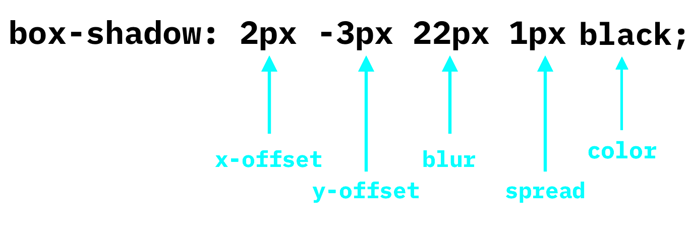
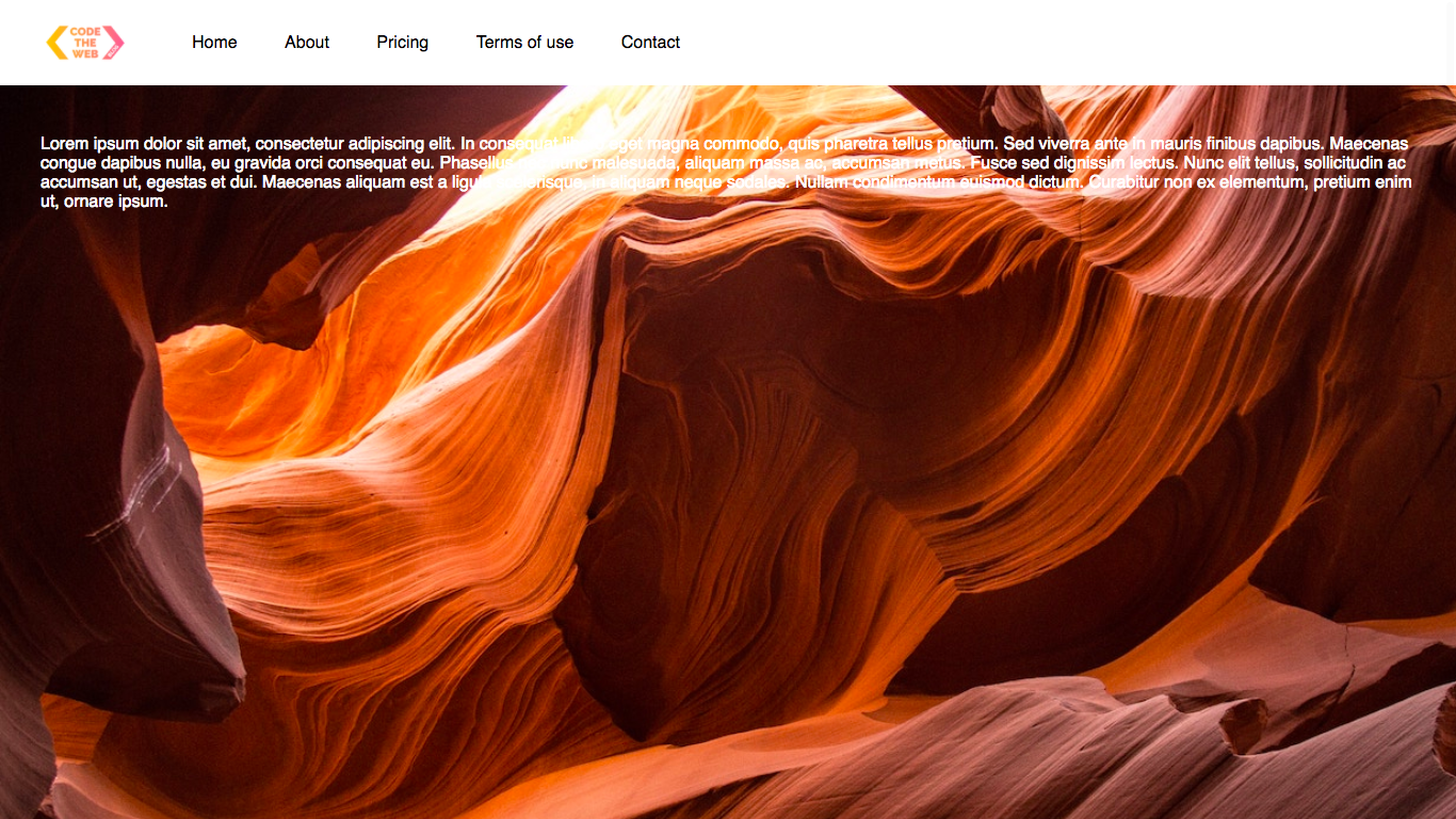
The x-offset and y-offset are how far to the side and up/down the shadow is, blur is how blurred the shadow is, and spread is how far out of the element the shadow spreads. All of these values can be negative, except for blur. Afterwards, we have the color that we want the shadow to be. Let’s add a very simple (but effective) shadow to our nav-bar:
header img {
    height: 80px;
    margin-left: 40px;
}
body {
    height: 125vh;
    background-image: url('https://codetheweb.blog/assets/img/posts/style-a-navigation-bar-css/background.jpg');
    background-size: cover;
    font-family: sans-serif;
    margin-top: 80px;
    padding: 30px;
}

main {
    color: white;
}

header {
    background-color: white;
    position: fixed;
    top: 0;
    left: 0;
    right: 0;
    height: 80px;
    display: flex;
    align-items: center;
    box-shadow: 0 0 25px 0 black;
}

header * {
    display: inline;
}

header li {
    margin: 20px;
}

header li a {
    color: black;
    text-decoration: none;
}
As you can see, we’re really only using the blur here - we are setting rest of the values (x-offset, y-offset and spread) to 0. Here is the result:
Awesome!!! Our navigation bar now has a shadow!!! 🎉
That’s it for today 😉
Conclusion
So, I hope you learned a lot in this article! Now you can go forth and make your own navigations bars. They are used by almost every website you visit, so are a very important thing to know how to code.
In future, I’ll be writing a tutorial on how to style a responsive navigation bar, meaning that it will adapt to different screen sizes (eg. show a ‘menu’ icon on mobile).
In the meantime, I’d really love it if you shared this or subscribed to the newsletter to receive new posts in your inbox. If you do either of those things, you are awesome and I will give you a lifetime supply of tacos 🌮 (not really, just my new marketing tactic 😜 ).
Have fun, keep coding and I’ll see you next time, where I’ll be talking about website icons in HTML (I thought I’d change it up a bit and do an HTML one). See you then!