Hero images are used by websites all over the internet and look awesome. Learn how to code one in this article…
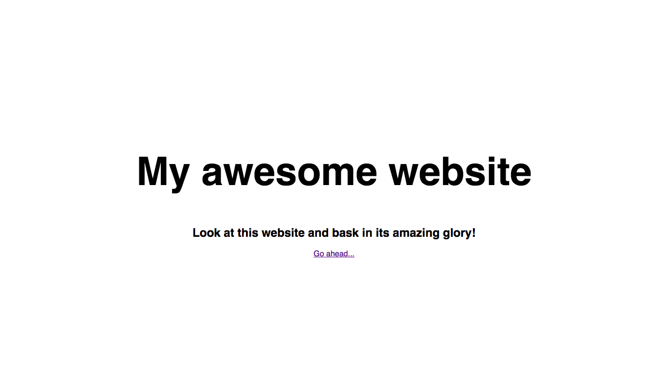
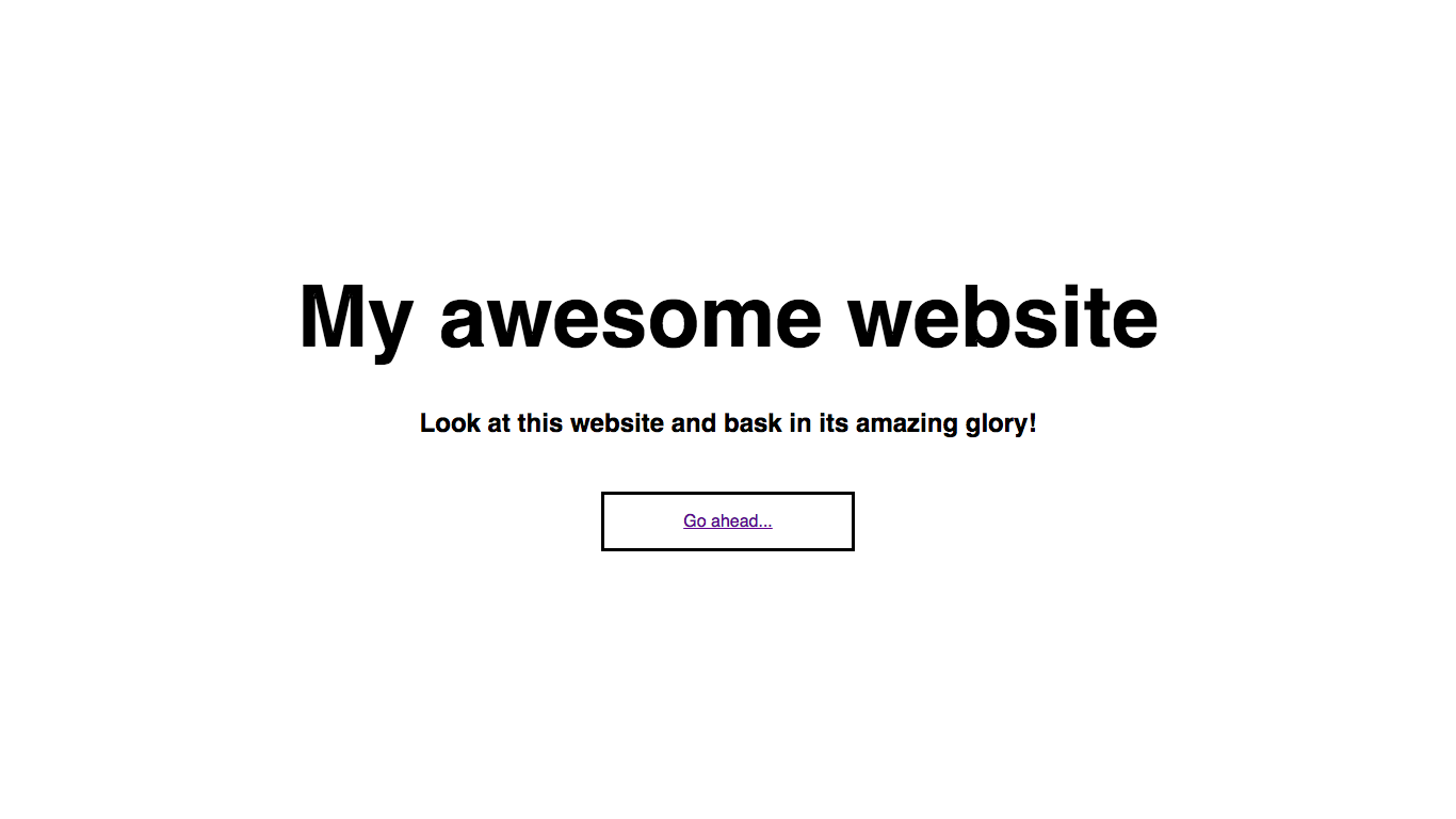
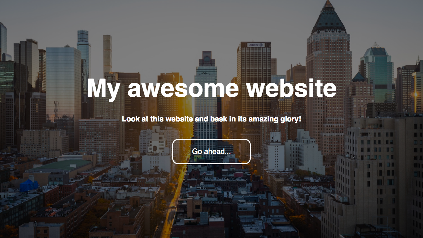
What we’ll be making
Here’s what we’ll be making today:
You can view a live demo here.
Let’s get going!
First of all, you will need to create a brand-new empty folder for this project. In it, create two new files: index.html and style.css.
Creating the HTML
To begin with, we need to create the HTML document structure:
<!DOCTYPE html>
<html>
    <head>
        <title>My awesome website</title>
        <link rel="stylesheet" href="style.css">
    </head>

    <body>
        Hello!
    </body>
</html>
Don’t forget to include the <link> to your stylesheet!
At this point save, open up your HTML file in a browser and check that everything is working.
The hero HTML code
The image part of the page (see the demo) is called the hero image. Let’s add our hero image and the content inside it to our HTML:
<!DOCTYPE html>
<html>
    <head>
        <title>My awesome website</title>
        <link rel="stylesheet" href="style.css">
    </head>

    <body>
        <section class="hero">
            <div class="hero-inner">
                <h1>My awesome website</h1>
                <h2>Look at this website and bask in its amazing glory!</h2>
                <a href="https://example.com/" class="btn">Go ahead...</a>
            </div>
        </section>
    </body>
</html>
Wooah, what’s going on here? Let’s break it down…
First, we create a <section> which will be our hero:
<section class="hero">

</section>
A <section> acts just like a <div> except it tells browsers and search engines that it is a section on our page.
Next, we add an inner <div> - this is so we can get our flexboxes working, which I’ll delve into later in this tutorial.
<section class="hero">
    <div class="hero-inner">

    </div>
</section>
Finally, we add our actual content - simply an <h1>, <h2> and a link (<a>).
The main content HTML code
As you can see from the demo, we have some dummy text below the hero so that we can scroll. To keep this article on-topic, we won’t be styling that in this article. So, let’s add our dummy text!
<!DOCTYPE html>
<html>
<head>
<title>My awesome website</title>
<link rel="stylesheet" href="style.css">
</head>
<body>
<section class="hero">
<div class="hero-inner">
<h1>My awesome website</h1>
<h2>Look at this website and bask in its amazing glory!</h2>
<a href="https://example.com/" class="btn">Go ahead...</a>
</div>
</section>
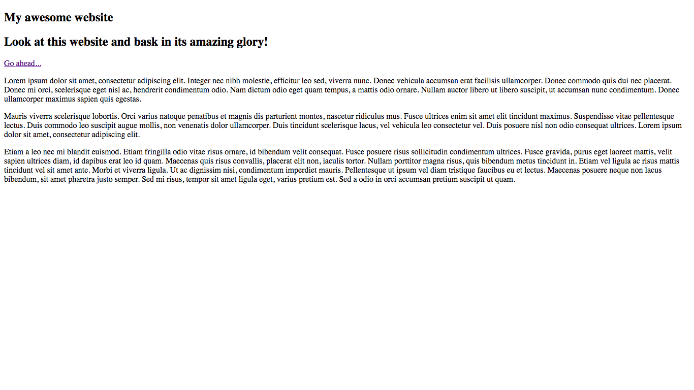
<main>
<p>Lorem ipsum dolor sit amet, consectetur adipiscing elit. Integer nec nibh molestie, efficitur leo sed, viverra nunc. Donec vehicula accumsan erat facilisis ullamcorper. Donec commodo quis dui nec placerat. Donec mi orci, scelerisque eget nisl ac, hendrerit condimentum odio. Nam dictum odio eget quam tempus, a mattis odio ornare. Nullam auctor libero ut libero suscipit, ut accumsan nunc condimentum. Donec ullamcorper maximus sapien quis egestas.</p>
<p>Mauris viverra scelerisque lobortis. Orci varius natoque penatibus et magnis dis parturient montes, nascetur ridiculus mus. Fusce ultrices enim sit amet elit tincidunt maximus. Suspendisse vitae pellentesque lectus. Duis commodo leo suscipit augue mollis, non venenatis dolor ullamcorper. Duis tincidunt scelerisque lacus, vel vehicula leo consectetur vel. Duis posuere nisl non odio consequat ultrices. Lorem ipsum dolor sit amet, consectetur adipiscing elit.</p>
<p>Etiam a leo nec mi blandit euismod. Etiam fringilla odio vitae risus ornare, id bibendum velit consequat. Fusce posuere risus sollicitudin condimentum ultrices. Fusce gravida, purus eget laoreet mattis, velit sapien ultrices diam, id dapibus erat leo id quam. Maecenas quis risus convallis, placerat elit non, iaculis tortor. Nullam porttitor magna risus, quis bibendum metus tincidunt in. Etiam vel ligula ac risus mattis tincidunt vel sit amet ante. Morbi et viverra ligula. Ut ac dignissim nisi, condimentum imperdiet mauris. Pellentesque ut ipsum vel diam tristique faucibus eu et lectus. Maecenas posuere neque non lacus bibendum, sit amet pharetra justo semper. Sed mi risus, tempor sit amet ligula eget, varius pretium est. Sed a odio in orci accumsan pretium suscipit ut quam.</p>
</main>
</body>
</html>
As you can see, all we did was stick some <p>’s inside a <main>. Like <section>, <main> acts very similar to a <div> except that it tells browsers and search engines that it is the ‘main’ content of the page.
That’s it for the HTML! Let’s move on to styling our page…
The CSS!
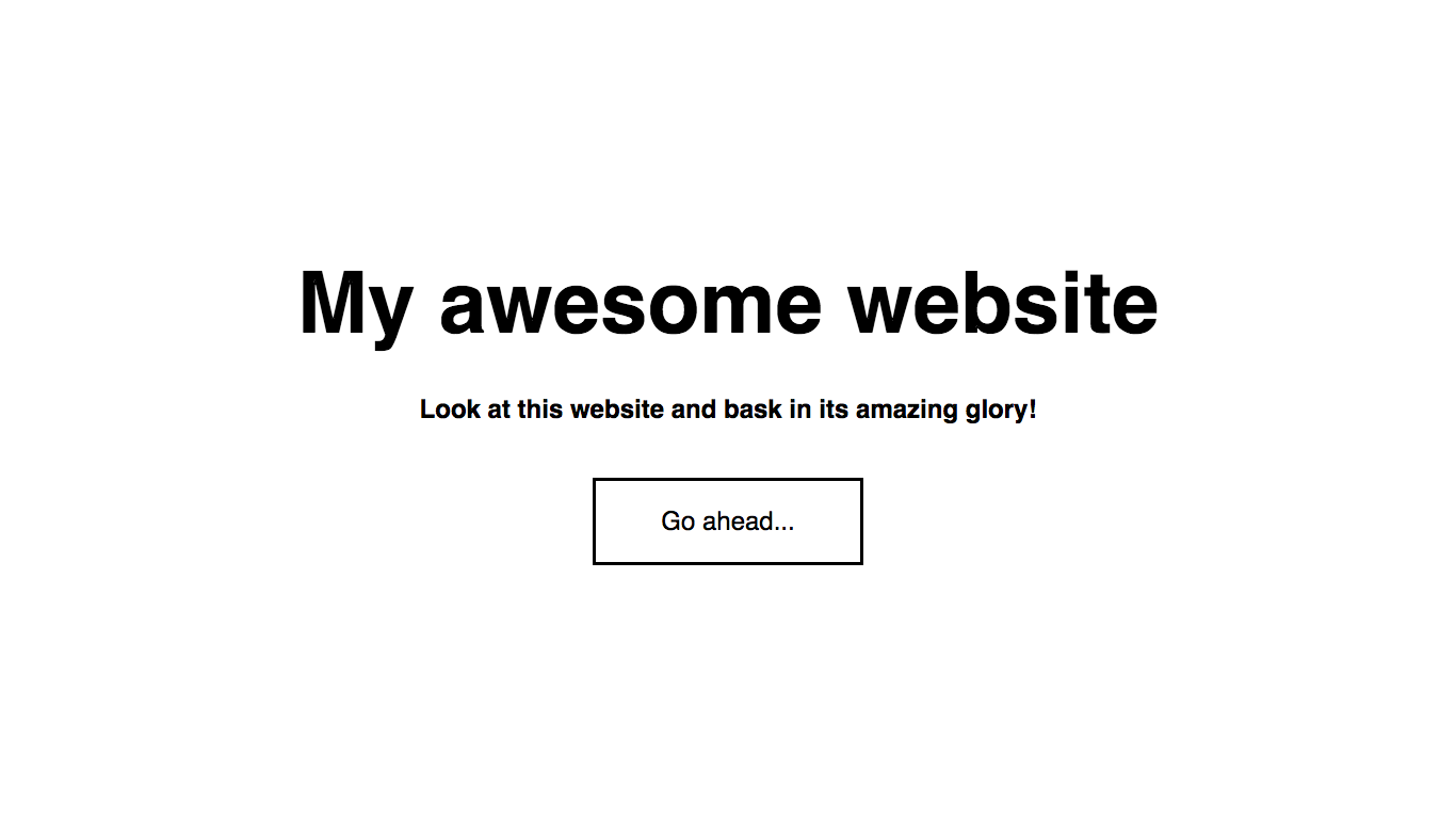
At the moment your website will look something like this:
That looks nothing like what we want - let’s add some styling! We’ll start with positioning the text and setting the sizing…
Body styling
First of all, let’s open up our style.css file and apply some general styling to the body:
body {
    margin: 0;
    font-family: sans-serif;
}
The body has a default margin, which we do not want interfering without image header, which is why we have set it to 0. The reason that we have set the font-family to sans-serif is so that you’re not stuck with Times New Roman 😜
You can actually set the text to be in any font you want, but it gets a little more complicated - I will go into that in a later article.
Hero positioning and sizing
Let’s get the positioning and sizing of our elements worked out so we know where everything will be on the page.
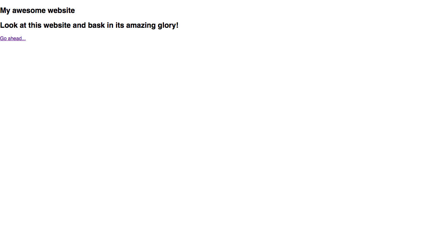
First of all, we want to style the actual hero section itself:
.hero {
    /* Sizing */
    width: 100vw;
    height: 100vh;
}
If you don’t already know, vw and vh stand for the percentage of the viewport width and height. In this case, we are setting our hero to be 100% of the browser width and height.
Save and reload your browser - now the hero section takes up the whole screen! (you have to scroll down to see the rest of the page)
We want our text to be centered both horizontally and vertically within our hero section, so it shows up in the middle of the screen. The best way to do this is using flexboxes (I wrote a little bit about perfect centering using flexboxes in the perfect centering section).
So, let’s add some perfect centering to our hero!
.hero {
    /* Sizing */
    width: 100vw;
    height: 100vh;

    /* Flexbox stuff */
    display: flex;
    justify-content: center;
    align-items: center;
}
Now, when you save reload your page, the text will be centered on the screen!
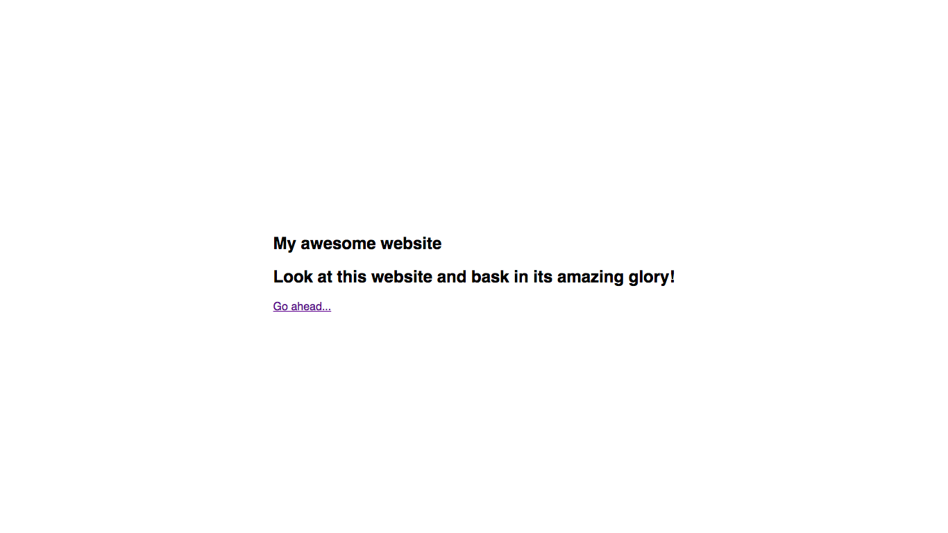
…or not.
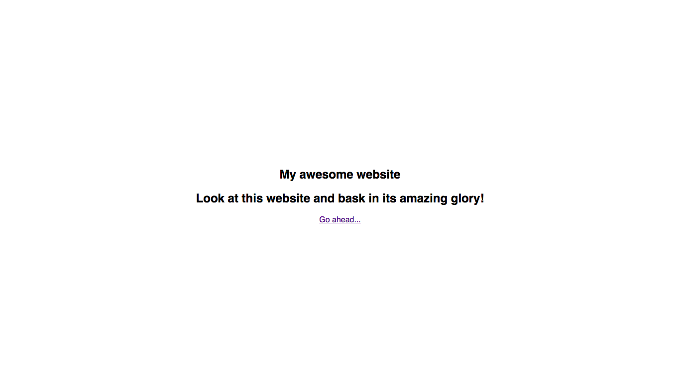
You see, we also need to make sure that our actual text is centered, not just the elements that the text is in. We can do this simply by using text-align: center:
.hero {
    /* Sizing */
    width: 100vw;
    height: 100vh;

    /* Flexbox stuff */
    display: flex;
    justify-content: center;
    align-items: center;

    /* Text styles */
    text-align: center;
}
There we go! Our hero content is now perfectly centered!
Text styling
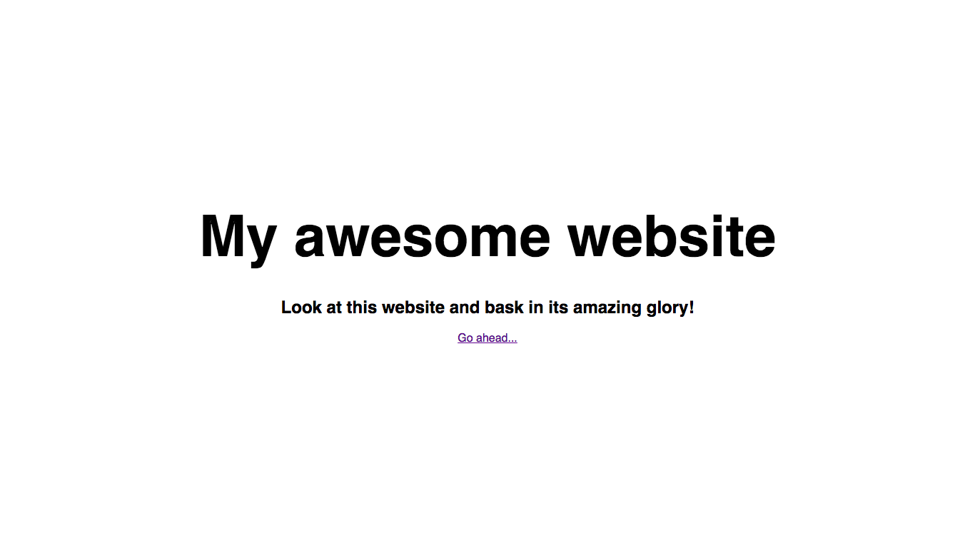
Now, let’s make our main title larger so that we know it’s the title:
.hero h1 {
    /* Text styles */
    font-size: 5em;
}
Result:
However, now there is an oddly large space between our title and subtitle. This is because by default for header elements, as its font-size increases then so do its margins. So, let’s tweak them a bit:
.hero h1 {
    /* Text styles */
    font-size: 5em;

    /* Margins */
    margin-top: 0;
    margin-bottom: 0.5em;
}
Now it looks a bit better!
Now that our title and subtitle look good, let’s style our button!
Button styling
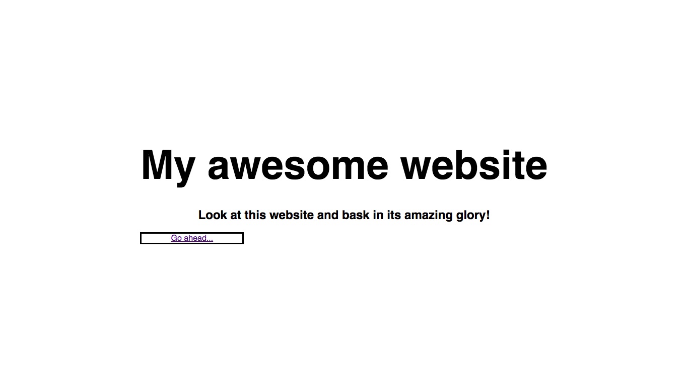
First of all, we need to give the button a display type of block (<a> elements are inline by default) so that it will behave like other elements. We also need to give it a width - otherwise, it will take up the full width of the screen. To help visualize what’s going on, let’s also add a border:
.hero .btn {
    /* Positioning and sizing */
    display: block;
    width: 200px;

    /* Border styles */
    border: 3px solid black;
}
Result:
Let’s add some margin and padding to make the button look a bit nicer:
.hero .btn {
    /* Positioning and sizing */
    display: block;
    width: 200px;

    /* Padding and margins */
    padding: 1em;
    margin-top: 50px;

    /* Border styles */
    border: 3px solid black;
}
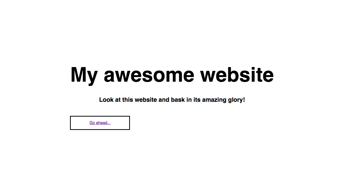
However, our button is still not centered! This is because it has a fixed width unlike the other elements in the flexbox. Luckily, the fix is quite simple - we simply add a margin-left and margin-right of auto! This works because auto takes up the maximum amount of space available, so that means there is an equal margin on both sides.
Let’s try it out:
.hero .btn {
    /* Positioning and sizing */
    display: block;
    width: 200px;

    /* Padding and margins */
    padding: 1em;
    margin-top: 50px;
    margin-left: auto;
    margin-right: auto;

    /* Border styles */
    border: 3px solid black;
}
Result:
Next, let’s add some styling to our button text, to override the default link styles and also make the text bigger. This is one big rule of web design, which is that people are more likely to click on bigger things. In this case, we want people to click on our button (call to action), so we will make the text bigger. So, let’s add the CSS:
.hero .btn {
    /* Positioning and sizing */
    display: block;
    width: 200px;

    /* Padding and margins */
    padding: 1em;
    margin-top: 50px;
    margin-left: auto;
    margin-right: auto;

    /* Text styles */
    color: black;
    text-decoration: none;
    font-size: 1.5em;

    /* Border styles */
    border: 3px solid black;
}
Result:
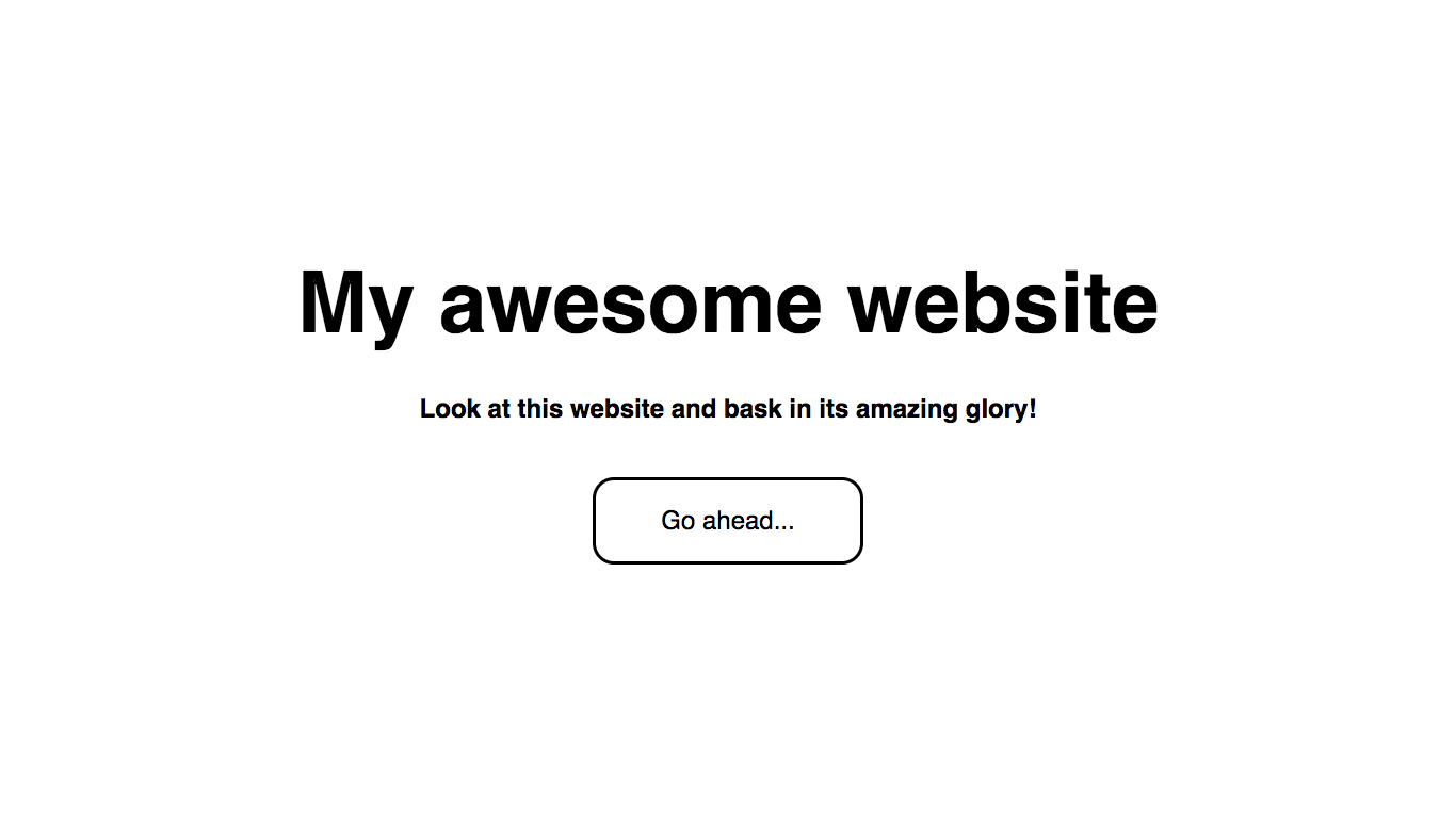
All that’s left is to round the edges of the button - we can do this using the border-radius property:
.hero .btn {
    /* Positioning and sizing */
    display: block;
    width: 200px;

    /* Padding and margins */
    padding: 1em;
    margin-top: 50px;
    margin-left: auto;
    margin-right: auto;

    /* Text styles */
    color: black;
    text-decoration: none;
    font-size: 1.5em;

    /* Border styles */
    border: 3px solid black;
    border-radius: 20px;
}
Hero background styling
Woo! After all that, it’s finally time to add our actual image to our hero!
We can do this using the background-image property, and also some other background-related properties:
.hero {
    /* Sizing */
    width: 100vw;
    height: 100vh;

    /* Flexbox stuff */
    display: flex;
    justify-content: center;
    align-items: center;

    /* Text styles */
    text-align: center;

    /* Background styles */
    background-image: url(https://codetheweb.blog/assets/img/posts/full-image-hero/image.jpg);
    background-size: cover;
    background-position: center center;
    background-repeat: no-repeat;
    background-attachment: fixed;
}
I’ll quickly go through what each of these do:
background-image: url('https://codetheweb.blog/assets/img/posts/full-image-hero/image.jpg');
Sets the background image of our hero to this image
background-size: cover;
Makes sure that our background is large enough to cover the entire hero.
background-position: center center;
Positions the image so that it is in the center of the screen.
background-repeat: no-repeat;
Stops the image from repeating/tiling.
background-attachment: fixed;
Makes the background image stay in the same spot, even you scroll down the page.
Save, reload and take a look at the result:
Awesome! However, it is very hard to see the text now. What if we tried making everything white?
Here are the lines of our CSS file to add/change:
body {
    margin: 0;
    font-family: sans-serif;
}

.hero {
    /* Sizing */
    width: 100vw;
    height: 100vh;

    /* Flexbox stuff */
    display: flex;
    justify-content: center;
    align-items: center;

    /* Text styles */
    text-align: center;
    color: white; /* ADD THIS LINE */

    /* Background styles */
    background-image: url('https://codetheweb.blog/assets/img/posts/full-image-hero/image.jpg');
    background-size: cover;
    background-position: center center;
    background-repeat: no-repeat;
    background-attachment: fixed;
}

.hero h1 {
    /* Text styles */
    font-size: 5em;

    /* Margins */
    margin-top: 0;
    margin-bottom: 0.5em;
}

.hero .btn {
    /* Positioning and sizing */
    display: block;
    width: 200px;

    /* Padding and margins */
    padding: 1em;
    margin-top: 50px;
    margin-left: auto;
    margin-right: auto;

    /* Text styles */
    color: white; /* CHANGE THIS LINE */
    text-decoration: none;
    font-size: 1.5em;

    /* Border styles */
    border: 3px solid white; /* CHANGE THIS LINE */
    border-radius: 20px;
}
You should have changed two lines and added one (see above).
Now, let’s take a look at the result:
Hmm, it still doesn’t work. However, if we darken the background image then it might! But how do we do this?
I’m going to tell you something cool - believe it or not, you can have multiple background-images for the same element! All you need to do is separate them with commas. So if we have our photo background image and then a semi-transparent black background-image on top, we will be able to see through - but it will have been darkened.
The thing is that background-image doesn’t take colors. But it does take gradients! So, we can make a gradient between two colors that are the same, and effectively use a ‘color’ as a background-image. Here is the CSS:
.hero {
    /* Sizing */
    width: 100vw;
    height: 100vh;

    /* Flexbox stuff */
    display: flex;
    justify-content: center;
    align-items: center;

    /* Text styles */
    text-align: center;
    color: white;

    /* Background styles */
    background-image: linear-gradient(rgba(0, 0, 0, 0.5),rgba(0, 0, 0, 0.5)), url('https://codetheweb.blog/assets/img/posts/full-image-hero/image.jpg');
    background-size: cover;
    background-position: center center;
    background-repeat: no-repeat;
    background-attachment: fixed;
}
This concept may be a little confusing to grasp, but think of it as if the gradient on top is like a sunglasses lense - it is in between you and the view, and darkens it. If you need any further help, I’m happy to in the comments.
Anyway, let’s preview our website - save and reload the page:
Yay! The text is finally readable!
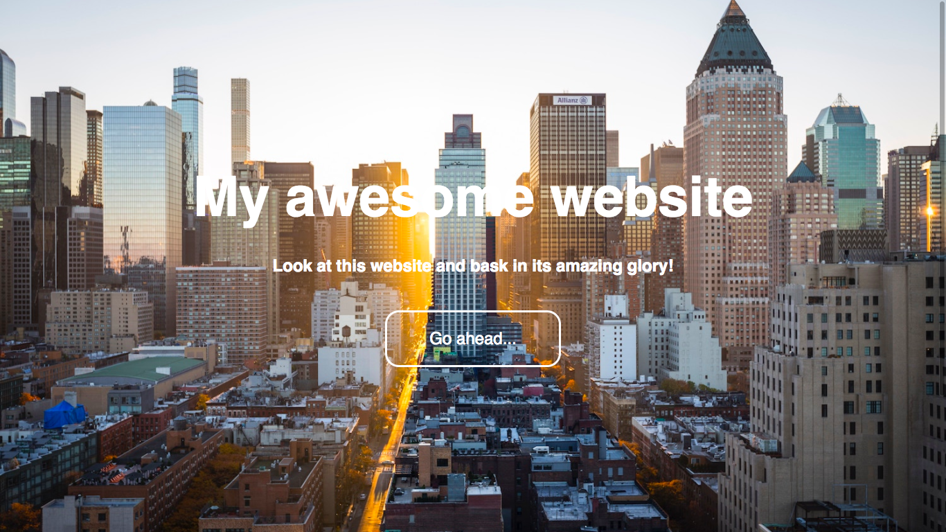
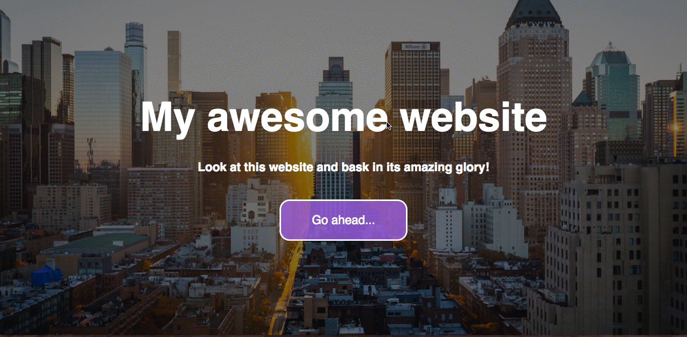
One more thing though - to help our button stand out against the background image, let’s give it a background-color of its own!
.hero .btn {
    /* Positioning and sizing */
    display: block;
    width: 200px;

    /* Padding and margins */
    padding: 1em;
    margin-top: 50px;
    margin-left: auto;
    margin-right: auto;

    /* Text styles */
    color: white;
    text-decoration: none;
    font-size: 1.5em;

    /* Border styles */
    border: 3px solid white;
    border-radius: 20px;

    /* Background styles */
    background-color: rgba(147, 112, 219, 0.8);
}
Result:
Conclusion
Awesome, you’ve made it! Now your website should look just like the demo - congrats 😀 - Hopefully it wasn’t too confusing 😜
As always, if you need any help or have any feedback then just say so in the comments below and I’ll get back to you!
If you found this article helpful, I’d really love it if you shared it or signed up to the newsletter to receive new posts in your inbox. If you do either/both of these things, you’re officially awesome and deserve a taco 🌮 🌮 🚀
Okay! Have fun, keep coding and I’ll see you next time, where I’ll be talking about how to make and style a navigation bar using HTML & CSS. See you then!