The CSS position property lets you position elements virtually anywhere you want. Learn how in this article…
Getting started
I think that it is best to learn by doing, so I highly recommend following along in all my tutorials. To follow along start by making a new project folder with index.html and style.css files in it. Add the following code to your index.html:
<!DOCTYPE html>
<html>
    <head>
        <title>CSS position property DEMO</title>
        <link rel="stylesheet" href="style.css">
    </head>
    <body>
        <p>I am just some normal, innocent text :|</p>
        <div class="div1">Div 1</div>
        <div class="div2">Div 2</div>
    </body>
</html>
Next, add the following CSS to you style.css so that we can see our <div>s better:
body {
    margin: 0;
    height: 5000px;
}
.div1 {
    background-color: cyan;
    width: 200px;
    height: 400px;
}

.div2 {
    background-color: magenta;
    width: 300px;
    height: 300px;
}
The reason for the body height is so that we can scroll on our page - you will see why this is relevant later in the tutorial. If you have a screen height that is larger than 5000px and can’t scroll, then seriously your screen is waaaaaaay too big 😝.
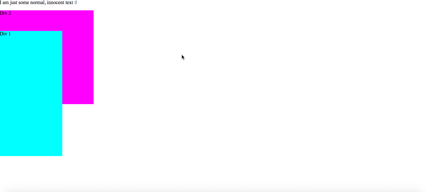
Cool! Now you’re ready to go! Open your index.html in a web browser - it should look like this so far:
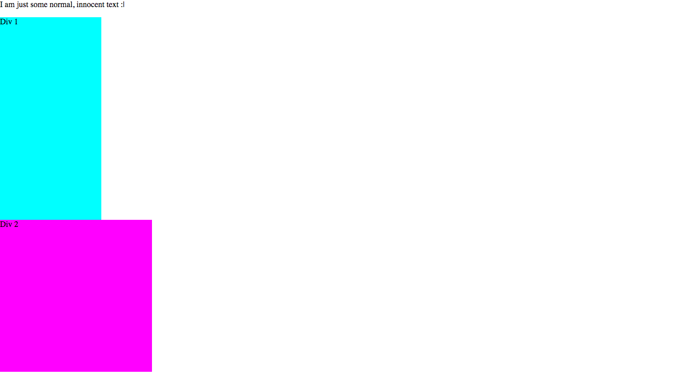
Note that it may look slightly different based on your screen size and resoultion. Anyway, let’s get going!
Properties you will be learning
In this tutorial you will learn how to use:
positiontop,bottom,leftandright
All of these properties work together to give an element a specific position. When you use a position value other than the default, you can position it using the top, bottom, left and right properties.
The top, bottom, left and right properties
These properties are used to position the element. It is positioned relative to different elements, based on what the position property of the element is (I’ll explain that in a sec).
The top, bottom, left and right properties accept all CSS units, but for this article we’ll be using px (pixels).
The position property
The position property accepts five values:
staticfixedabsoluterelativesticky
Let’s go through what each of them do…
position: static
static is the default position type. All elements have this position type unless you state otherwise, so you really don’t need to worry about it - it is the default behaviour that you already know and you will almost never need to use it.
The top, bottom, left and right properties do not do anything to an element with a position of static.
position: fixed
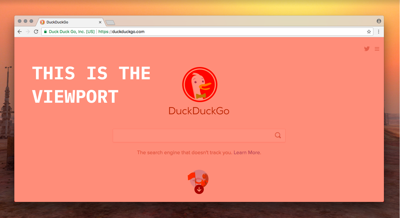
When an element has a position property of fixed, it is positioned relative to the viewport (see the image above, the viewport is highlighted in red).
What this means is that let’s say an element has a top value of 100px, it will be positioned 100px from the top of the viewport. But what happens if you try scrolling down? It’s still 100px from the top of the screen. This means that an element with a position value of fixed stays in the same spot even when you scroll down!
Let’s see the example I’ve talked about in action on our Div 1:
.div1 {
    background-color: cyan;
    width: 200px;
    height: 400px;
    position: fixed;    /* Add this line */
    top: 100px;         /* And this one  */
}
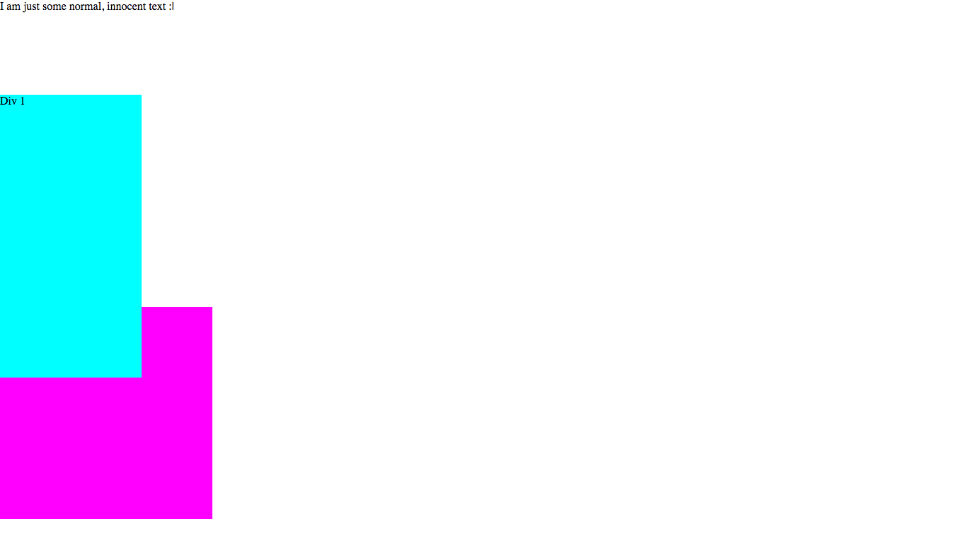
Add it to your CSS, reload the page and try scrolling down - Div 1 stays in the same spot on the screen!
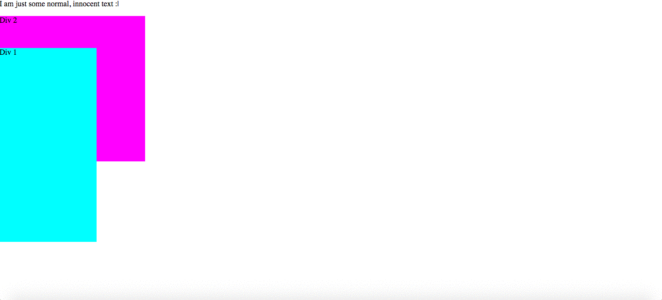
You will also notice that Div 1 covers part of Div 2 - I will deal with overlapping and layers a bit further down the page (let’s get all the position types out of the way first).
Another thing to note is that Div 2 gets moved up, because the absolute element is removed from the document flow. This means that there is no space left for where the element would normally be.
position: absolute
absolute positioning is positioned relative to one of its ancestors, instead of the viewport like with position: fixed.
Wait what??? Ancestors??? Is this some ancient burial ritual????
No, an ancestor is just one of the parents of an element. For example:
<div>
    <ul>
        <li>Hello</li>
    </ul>
</div>
Here, the <div> and <ul> are both ancestors of the <li>.
So, which ancestor does it use? Well, it is positioned based on its closest ancestor with a position other than static. If there is not an ancestor that fits the criteria, it is positioned relative to the body element. Note that the <body> is different to the viewport, because it can be scrolled up and down (moved).
Absolute positioning can be a bit complicated, but don’t dispair! Basically,
position: absoluteis positioned relative to the the body, unless an element that it’s inside has apositionvalue. Simplez!
To clear things up more, let’s do an example - update your CSS file to give Div 1 a position of absolute:
.div1 {
    background-color: cyan;
    width: 200px;
    height: 400px;
    position: absolute;  /* Change this line from fixed */
    top: 100px;
}
Now save and reload the page:
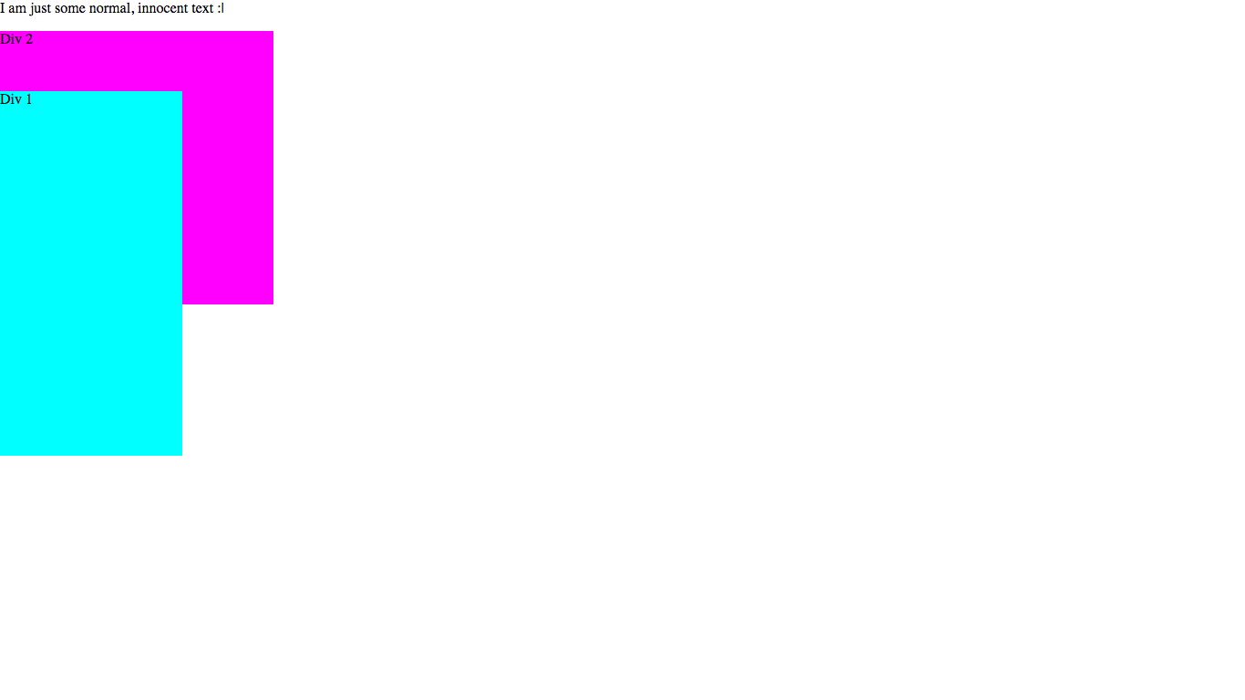
What? But it looks the same! Exactly… Now Div 1 is relative to the <body> instead of the viewport. This means that it will look the same, but now it moves down when you scroll - try it yourself!
As you can see, most of the time the difference between fixed and absolute is that absolute moves when you scroll but fixed doesn’t - due to the reasons I talked about above.
position: relative
relative positoning is very different to absolute and fixed. It is positioned relative to itself, instead of another element. Unlike absolute and fixed, with relative positioning the element is still a a part of the document flow.
Basically, the way that relative positioning is calculated is a two-step process:
- Render the elements like normal (like it would look without a
positionvalue) - The element is moved based on its
top,bottom,leftandrightproperties (eg.100pxto the downwards if it hastop: 100px). Note that the other elements do not move to fill any gaps or make way for the element, they stay where they are. This creates an empty space the size of the element in the document flow.
Example time! Let’s give Div 1 a position of relative:
.div1 {
    background-color: cyan;
    width: 200px;
    height: 400px;
    position: relative;  /* Change this line from absolute */
    top: 100px;
}
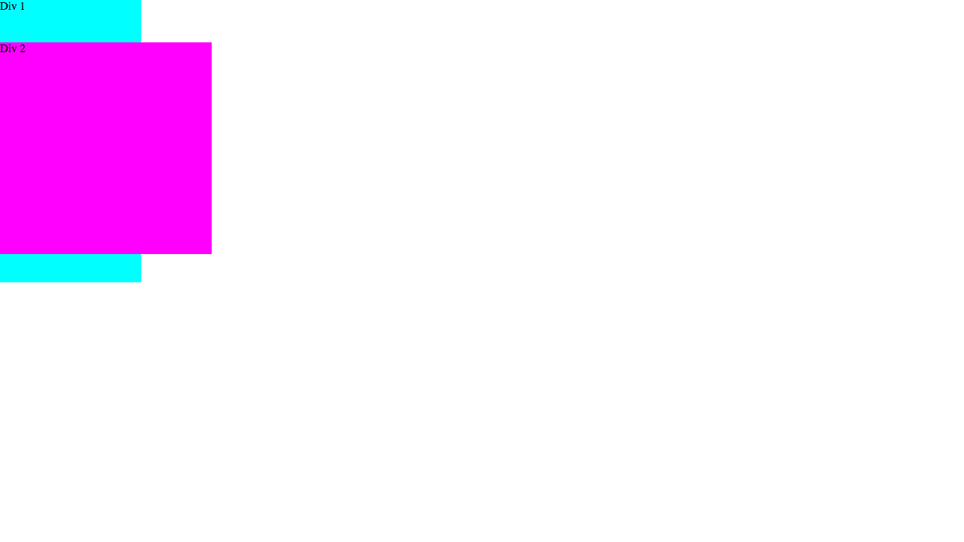
Save and reload the page, then take a look:
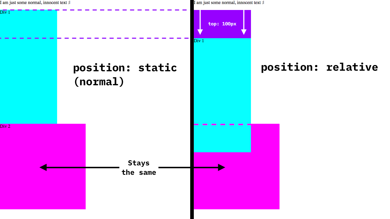
Now the page is exactly the same as right at the beginning, except that Div 1 is moved down 100px. If this was done by setting margin-top: 100px then Div 2 would have moved down as well, but because we are using relative positioning it stays in the same spot regardless!
Here is the difference visualized:
Let’s continue!
position: sticky
position: sticky actually just toggles between two of the other positioning types: fixed and relative. position: sticky is most commonly used with the top property, for cases when you want something to stick to the top of the viewport once you scroll past it.
First, let’s look at an example. Change your CSS position attribute to sticky:
.div1 {
    background-color: cyan;
    width: 200px;
    height: 400px;
    position: sticky;  /* Change this line from relative */
    top: 0; /* Change this from 100px */
}
The reason that we are changing the top value to 0 is so that Div 1 will stick to the top once we scroll past it. Save, reload your page and see what happens…
The element starts out with relative positioning, until the top of the element reaches 0px from the top of the viewport (because of the top value of 0). After that, the positioning becomes fixed with a top value of 0 (at the top of the screen).
Great job, now you know all the CSS position values and what they do! This was pretty complicated stuff, so if you’re confused then you can go and read back through, or ask for help in the comments.
Overlapping
This is the final thing that I will be covering in this article. Look back at the from above - you will see that Div 1 is overlapping Div 2. But what if you wanted Div 2 to overlap Div 1? The is where the z-index property comes into play.
The z-index accepts integers, both positive and negative. It doesn’t support any types of units however. Also note that z-index only works on elements with a position property. By default, an element has a z-index of 0.
So if we want to make our Div 2 overlap our Div 1, we will have to give Div 2 a higher z-index. We can do this either by setting the z-index of Div 2 to 1 or the z-index of Div 1 to -1. In this case because we’ve been styling Div 1, let’s go with the second option.
Add a z-index of -1 to your Div 1 styling:
.div1 {
    background-color: cyan;
    width: 200px;
    height: 400px;
    position: sticky;
    top: 0;
    z-index: -1;  /* Add this line */
}
Save, reload, scroll down a bit so the <div>s are overlapping and take a look:
You will see that now Div 2 overlaps Div 1!
Conclusion
Ok, that’s it for today. I hope that you learned something!
If you liked this article, I’d really appreciate if you shared it and signed up to the newsletter.
If you have any questions, feedback or just want to say hi then you can do so in the comments below.
Have fun and I’ll see you next time, where I’ll be talking about something a little different… See you then!