Learn how to change the way text appears on a website, and learn how to use the most extensive and powerful free font database in the world!
Hey everyone! Welcome back to another year of Code The Web! Hopefully, you had a good New Year’s, and have made some good resolutions for 2018…

Today I’m going to be talking about text-related CSS properties, as well as how to spice up your website with this nifty thing called Google Fonts.
Let’s get going!
Getting started
I recommend following along in all of my tutorials, as it really helps you get a better grasp on the subject. If you want to follow along through this tutorial, here’s how to get started.
First, create a new project folder with blank index.html and style.css files inside.
Next, let’s write some basic HTML to test our font properties on. Add the following to your index.html:
<!DOCTYPE html>
<html>
    <head>
        <title>CSS Fonts!</title>
        <link rel="stylesheet" href="style.css">
    </head>
    <body>
        <span>Look at me, I am some awesome text!</span>
    </body>
</html>
Open your index.html file in a browser - it should look something like this:
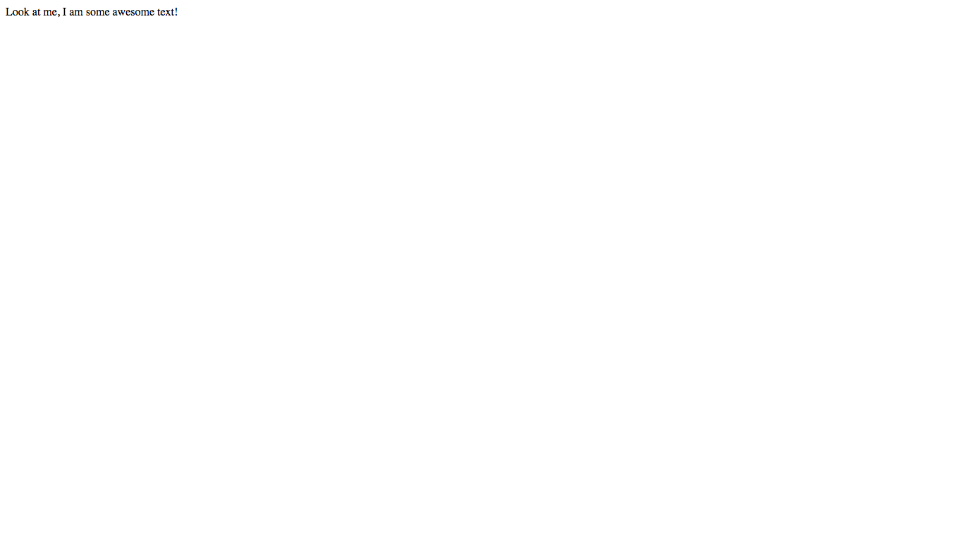
Now we’re good to go!
font-size
You may already know about font-size because it is a very common property, but I’ll go through it anyway (you can skip if you want).
font-size is quite straight-forward, it determines the size of the text. It accepts a value in any CSS unit. Let’s try it out!
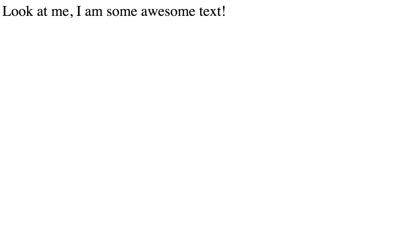
Open up your style.css file, and style the <span> to have a font-size of 50px - see if you can work out the code on your own…
span {
  font-size: 50px;
}
Here is the result:
font-weight
font-weight sets the thickness of the text (eg. bold). It takes the following values:
lighternormalboldbolder- One of the following numbers:
100,200,300,400,500,600,700,800,900
The numbers go from 100 being the thinnest to 900 being the thickest. 400 is equivalent to normal and 700 is equivalent to bold. Note that the numbers do not have a unit after them.
Let’s try making our font lighter - add the following to your CSS file:
span {
  font-size: 50px;
  font-weight: lighter; /* Add this line */
}
Result:
What?! Nothing happened! This is because not all fonts come with all weights. This is because the designer of the font needs to design each weight of the font individually, and lots of font designers will not end up designing up to 9 versions of the same font. In this case, the designer of this font has not made a lighter version - so the browser just shows the closest equivalent which is normal.
In my next article, I’ll go into the behind-the-scenes of how the different font weight files are actually specified.
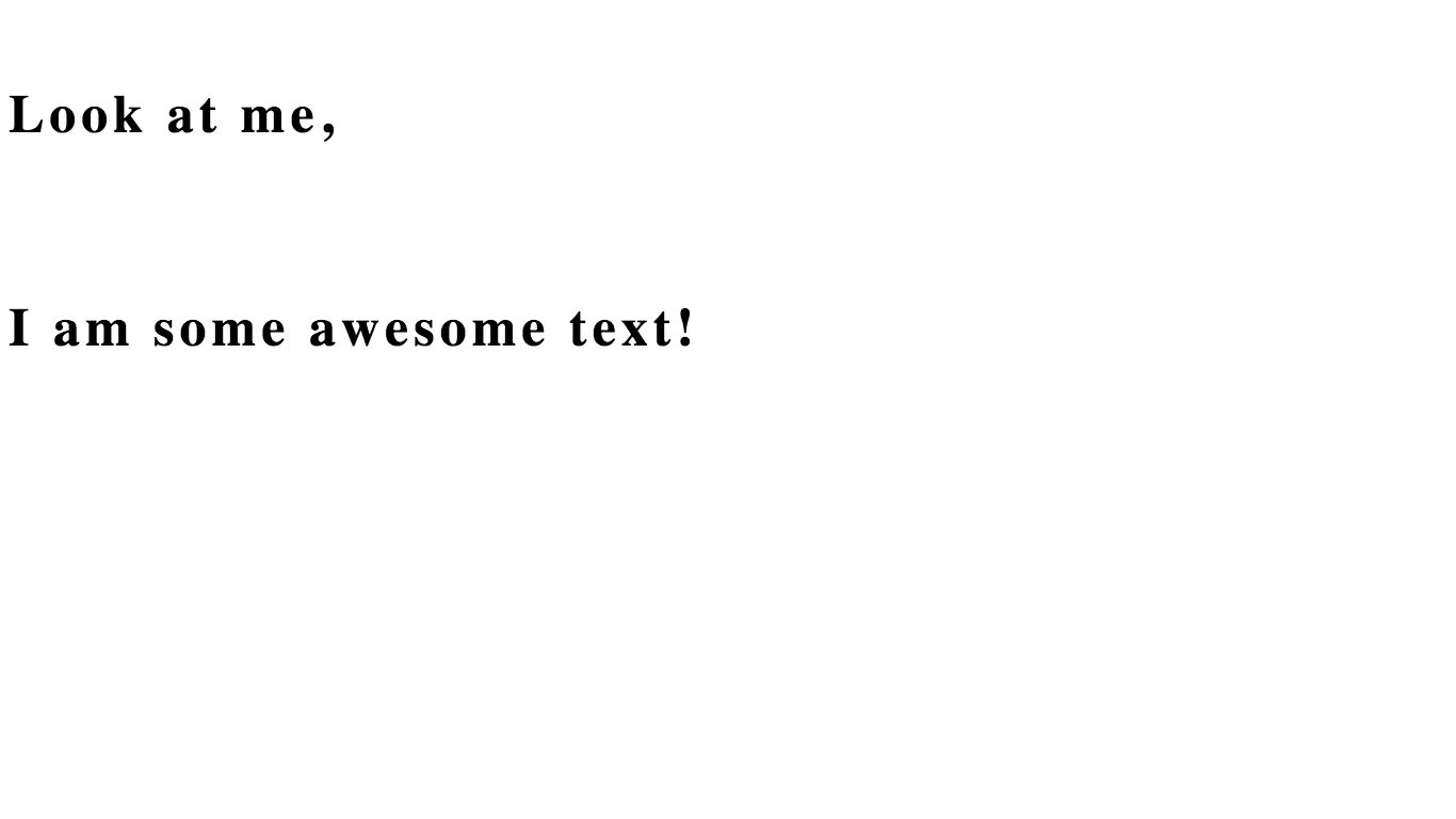
Okay, let’s try making our text bold - the designer of this font has made a bold version…
span {
  font-size: 50px;
  font-weight: bold; /* Change this line */
}
Result:
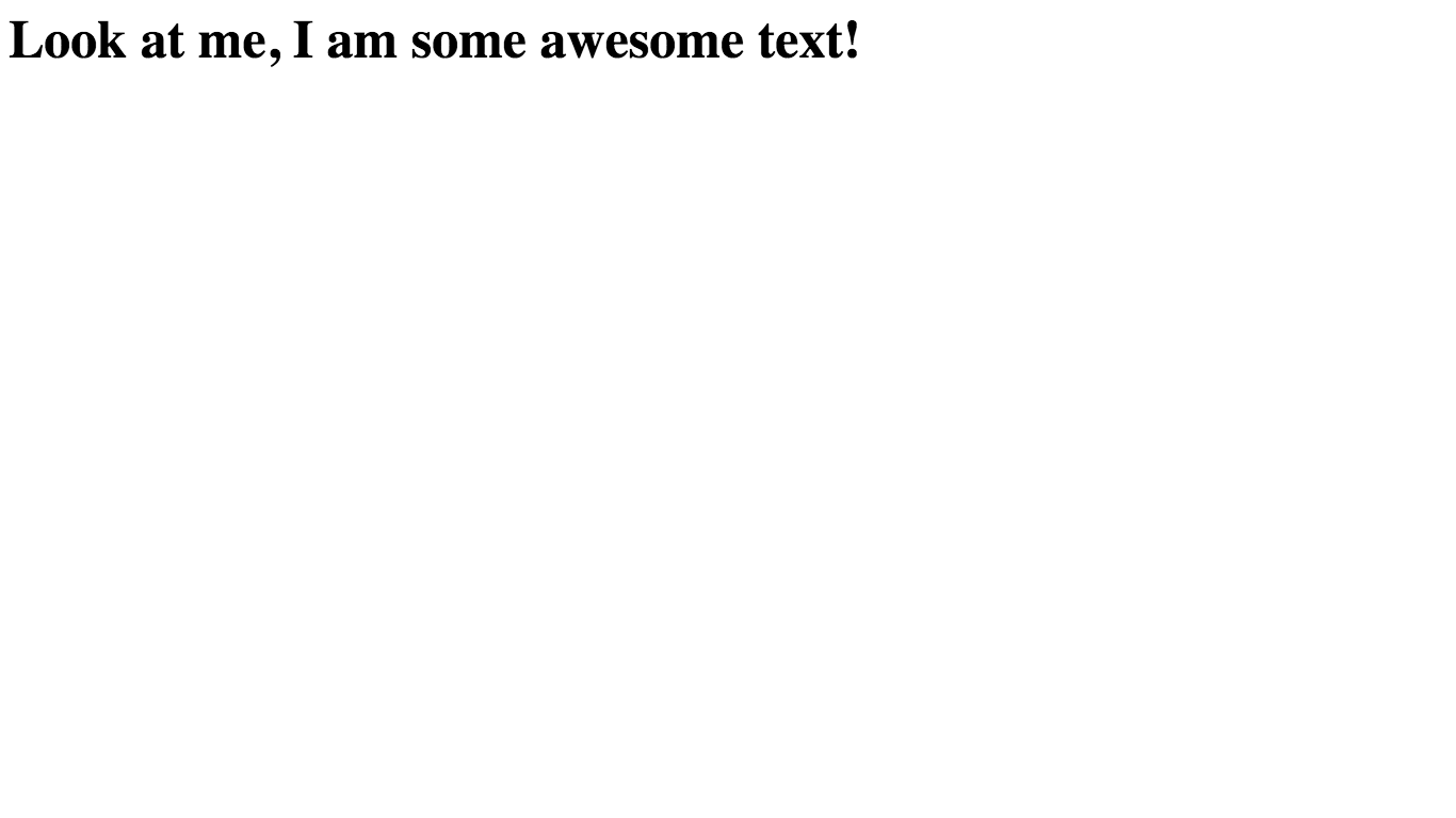
Woo! Let’s move on…
line-height
line-height basically controls how high each line of text is. The larger the line-height, the more vertical space between the text.
Like font-size, line-height accepts a value in any CSS unit. Let’s try it out!
First of all, let’s split our text onto two lines so we can see the line-height properly by adding a <br> in our HTML:
<!DOCTYPE html>
<html>
    <head>
        <title>CSS Fonts!</title>
        <link rel="stylesheet" href="style.css">
    </head>
    <body>
        <span>Look at me, <br>I am some awesome text!</span> <!-- Change this line -->
    </body>
</html>
Result:

Now, let’s try setting our line-height to 200px:
span {
  font-size: 50px;
  font-weight: bold;
  line-height: 200px; /* Add this line */
}
Now, take a look at the result:
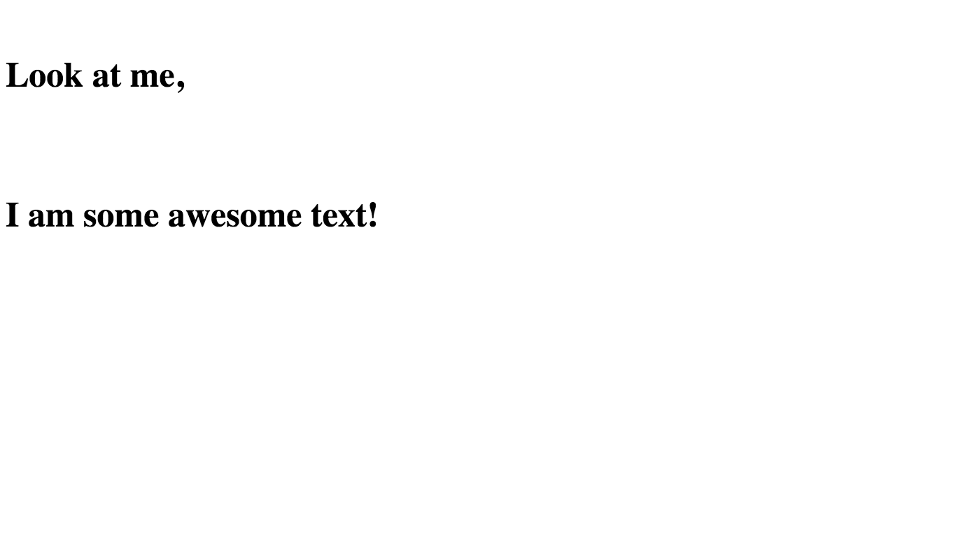
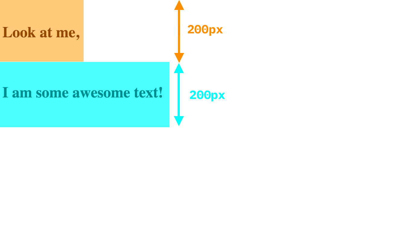
As you can see, there is now much more space between the lines of text.
But you may be wondering - how does the line height create more space between the lines? This is because technically, there is no space between the lines. The lines are each 200px high, and the text is vertically centered on the lines. This means that as the line-height gets bigger but the font-size stays the same, the gaps between the actual text will get bigger. Here is a diagram:
line-height works well when using em units because it means you can set the line-height relative to the font-size. For example, line-height: 2em would make the line-height double the size of the text.
letter-spacing
letter-spacing determines the amount of space in between each letter and takes a value in any CSS unit. Let’s jump right in and try it out!
Try giving the text a letter-spacing of 5px…
span {
  font-size: 50px;
  font-weight: bold;
  line-height: 200px;
  letter-spacing: 5px; /* Add this line */
}
Here’s the result:
As you can see, the letters are much more spread out. This example looks kind of ridiculously spread out to make the letter-spacing clear, but often it is good for minor adjustments (similar thing goes for line-height).
font-family
The font-family tells the browser which font to display the text in. Here are the default fonts available:
- serif
- sans-serif
- cursive
- fantasy
- monospace
Let’s try setting our font to fantasy (don’t ask me why it is called that):
span {
  font-size: 50px;
  font-weight: bold;
  line-height: 200px;
  letter-spacing: 5px;
  font-family: fantasy; /* Add this line */
}
Here is the result:
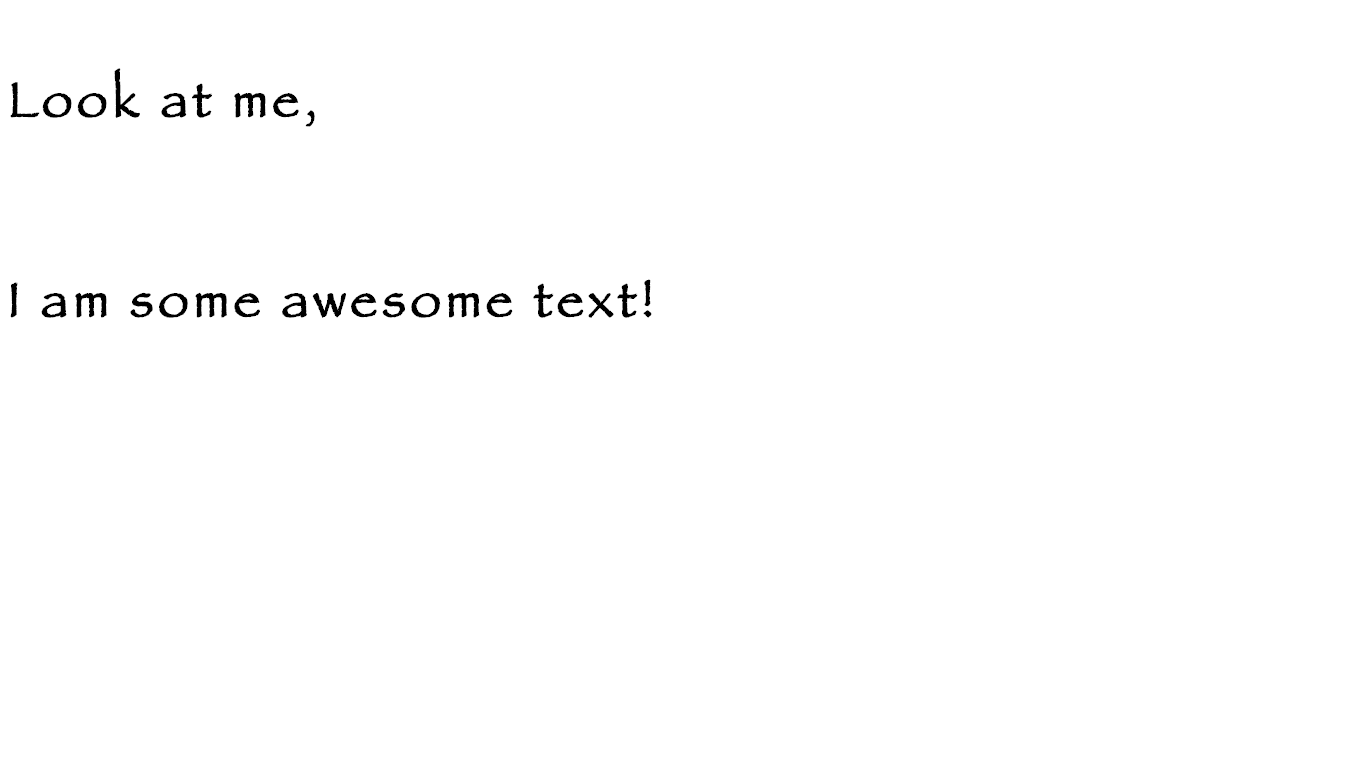
Awesome!
Note that the default fonts might be different on different computers or browsers because it is what the browser deems to be the default font for that category. Generally, the fonts will look similar though.
You can also specify any font name that is installed on the computer system (if the font name contains a space, surround it with quotes eg. font-family: "Modern Sans"). The problem is, the font will not work if it is not installed on the user’s machine. This is where Google Fonts comes in…
Google Fonts
Google Fonts is a library filled with thousands of awesome (and free 😋 ) fonts.
Talking of free: Always be careful when using a font online, sometimes the license doesn’t allow it to be used online or for commercial use, or you may have to buy a license. Luckily all the fonts on Google Fonts are completely free, so you don’t have to worry!
The good thing about using a font from Google Fonts is that they host and create a font stylesheet for you. This means that all you need to do is link to one of their files and the font will work for everyone - even if the user doesn’t have it installed on their computer.
Let’s add a font from Google Fonts to our website!
First of all, go to the Google Fonts website if you haven’t already. When you get there, you will see a bunch of font specimens:
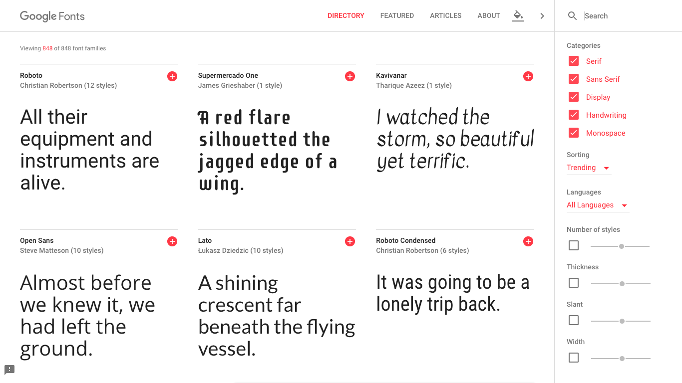
There is also a search box and many advanced filters to find your favorite font - you can even filter by things such as thickness or width!
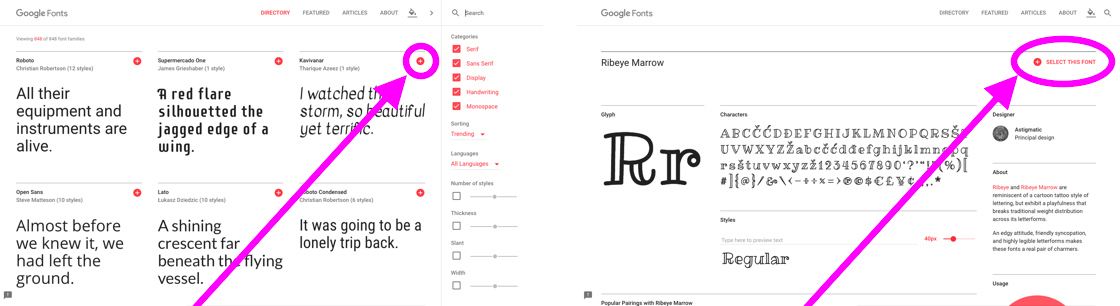
In this case, I have chosen the font Ribeye Marrow. You can either follow along with me using that font or pick your own.
Once you have a font, click the red plus button - the image below shows how to do it on a specific font page or straight from the home page:
After doing this, a small panel will appear in the bottom right corner of your screen:
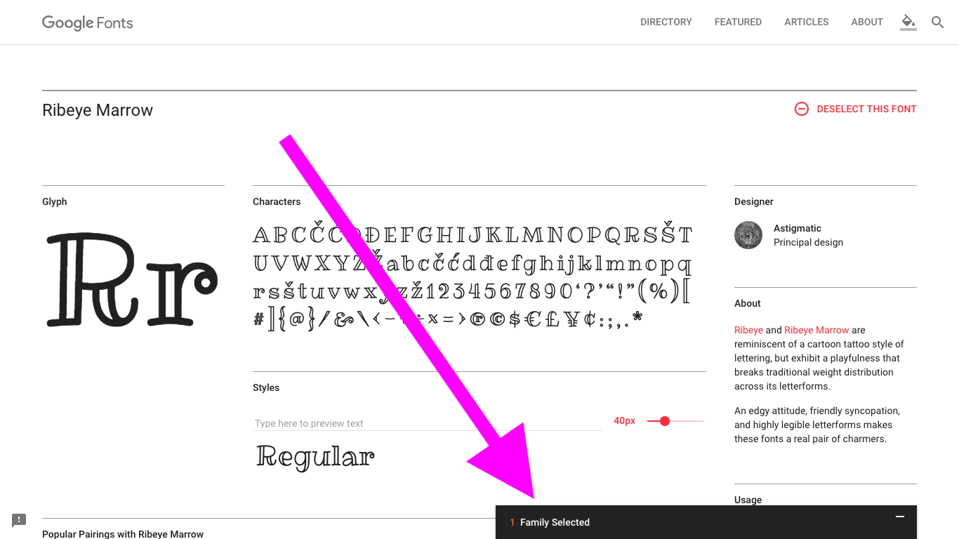
Open it by clicking on it…
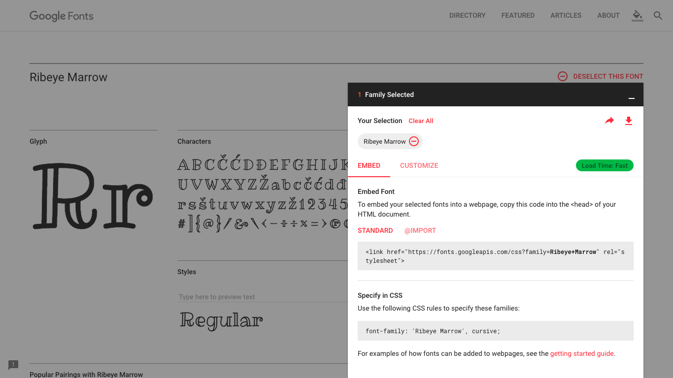
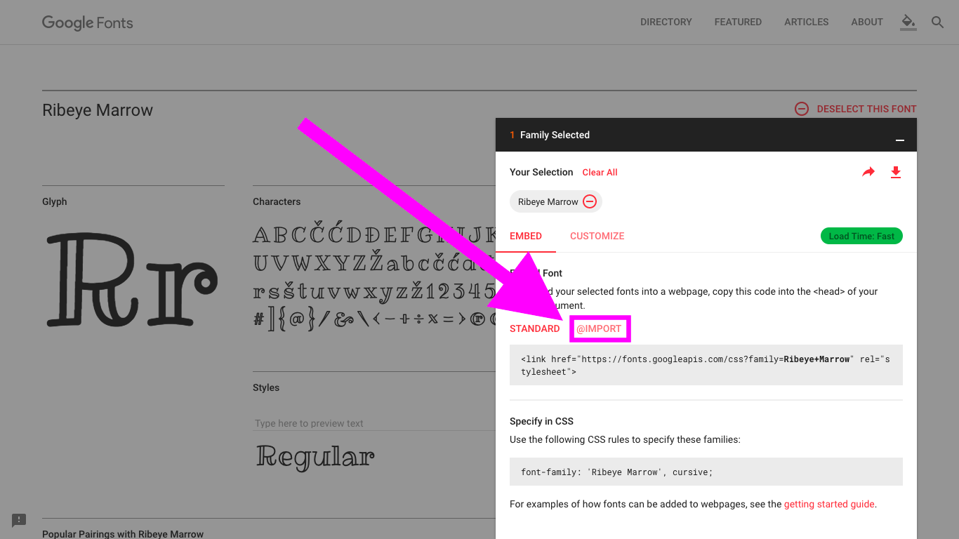
First of all, we will need to link to the font so that the browser knows where to find the files. There are two ways to do this: using HTML (standard) or CSS (@import). Personally, I prefer CSS as the font is part of the styling of the page so it makes sense to put it together.
To use the CSS option, click on “@IMPORT”
Next, copy the middle line of code (the one with @import in it):
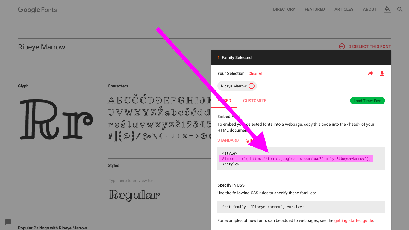
Now, we need to paste it into our CSS code - but where? @import statements must always be outside of the curly brackets, but it really doesn’t matter where in the document - as long as it is above the place where the font is used (the font-family property). As a general rule, I like to put Google Font imports at the top of CSS files so that the rest of the CSS file has access to it.
I’ll explain more about CSS @imports in another article.
Let’s paste in our line of code:
@import url('https://fonts.googleapis.com/css?family=Ribeye+Marrow'); /* Add this line */

span {
  font-size: 50px;
  font-weight: bold;
  line-height: 200px;
  letter-spacing: 5px;
  font-family: fantasy;
}
Reload the page - you will see that nothing has changed! This is because we still need to declare the font using font-family. The reason for using the @import line is so that the font will work even if it is not installed on the user’s computer.
Let’s use our font! We simply do this by giving the name of the font as a value to the font-family property:
@import url('https://fonts.googleapis.com/css?family=Ribeye+Marrow');

span {
  font-size: 50px;
  font-weight: bold;
  line-height: 200px;
  letter-spacing: 5px;
  font-family: "Ribeye Marrow"; /* Change this line */
}
Remember to include quotation marks if the name has a space!
Here is the result:
Now our text is in the font Ribeye Marrow!
Conclusion
Woo! That’s it for today! Hopefully, this article was useful and helped you along your coding journey. As always, if there was anything that you didn’t get or if you have any feedback, tell me in the comments.
Also, these articles don’t come out of thin air! Looking at my Pomodoro Timer, so far I’ve spent 3 hours and 20 minutes on this article, and have just passed to 40,000 word mark on this blog!
While your nice comments and knowing that I am helping you all make it worthwhile, I’d really appreciate it if you shared this or this blog with your friends or signed up to the newsletter to get the latest articles in your inbox.
See you next time, where I’ll be talking about using custom font files to extend your font choices beyond Google Fonts. See you then! Have a great and productive 2018 filled with lots of coding fun! 🙌 🎆 🚀